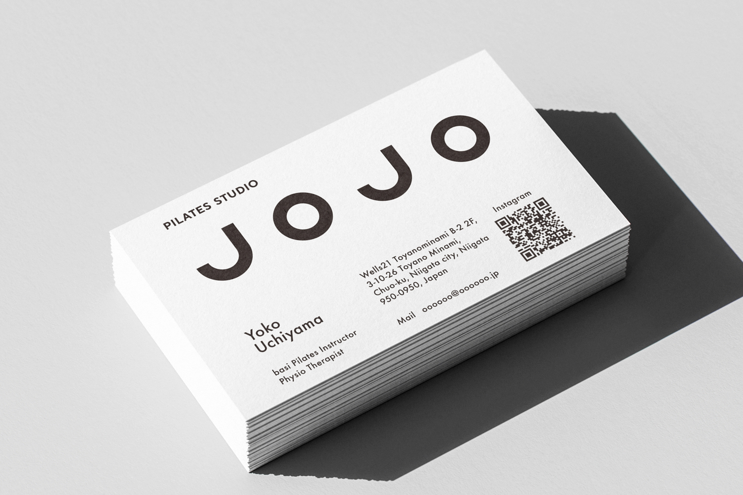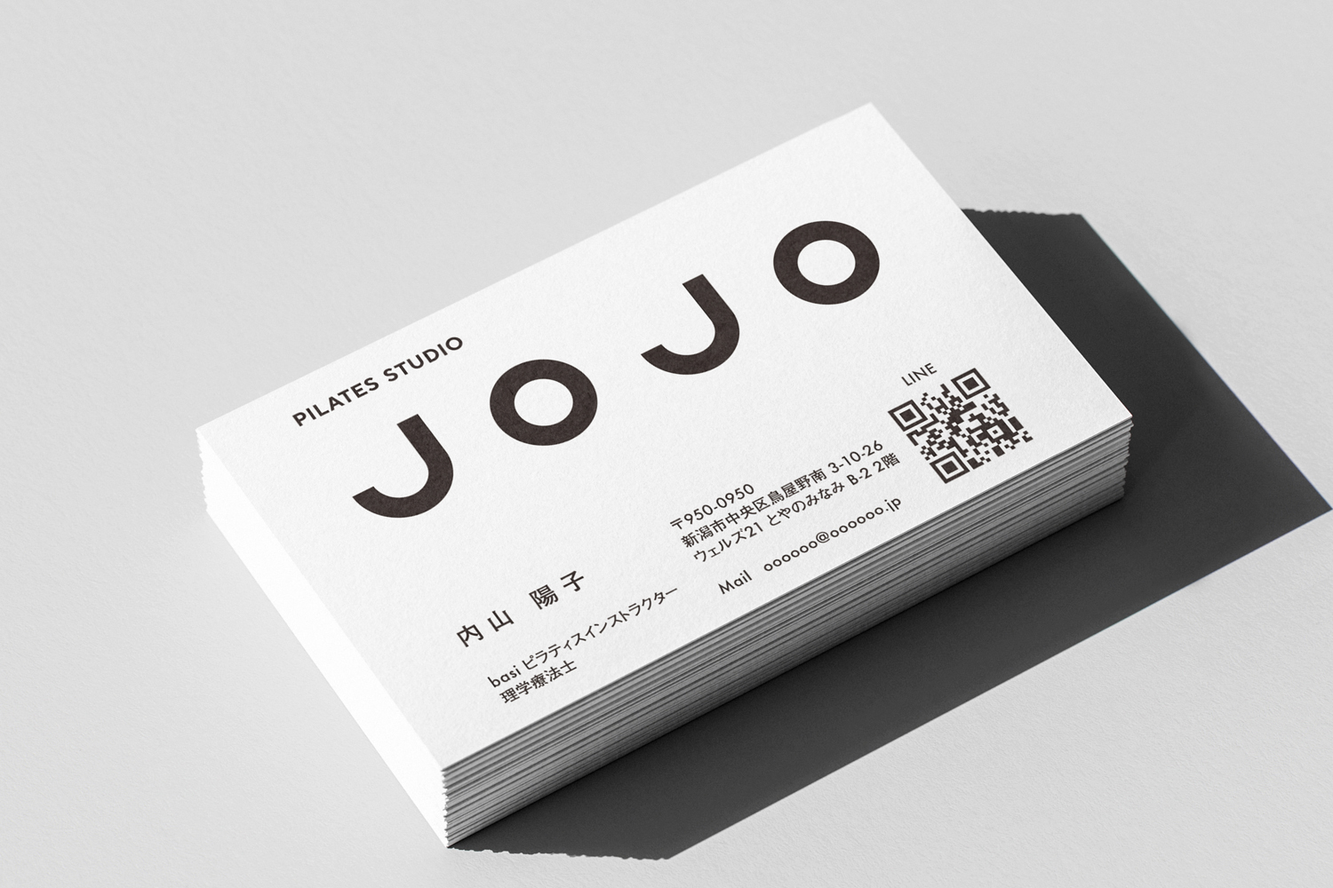
The brand design for a fully private Pilates studio that opened in Niigata City was handled by DESIGN DESIGN. Studio JOJO is a fully private studio offering both machine and mat Pilates.
With over 20 years of experience as a physical therapist, our instructor provides personalized sessions tailored to each individual’s unique body. Integrating BASI Pilates, the sessions aim to realign and restore the body from the ground up. We also offer treatments focused on rehabilitation and improving physical discomfort.
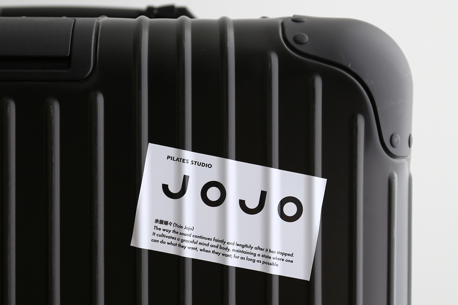
Brand Concept: “Yoin Jojo (Graceful Resilience)"
The way the sound continues faintly and lengthily after it has stopped. It cultivates a graceful mind and body, maintaining a state where one can do what they want, when they want, for as long as possible.
Design Concept: "Always in Peak Condition"
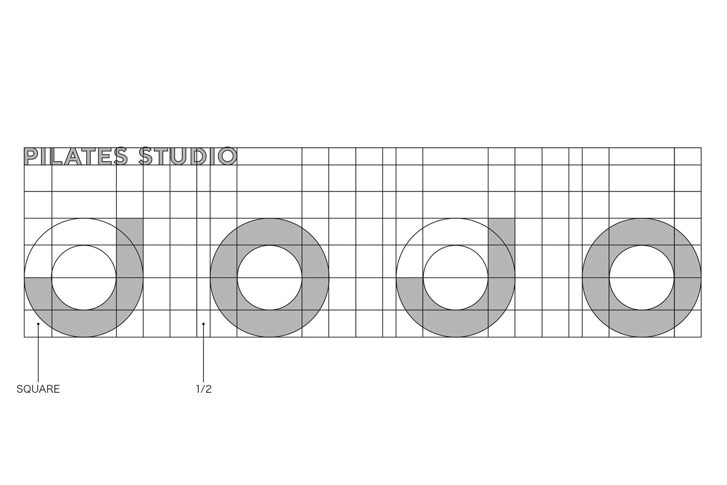
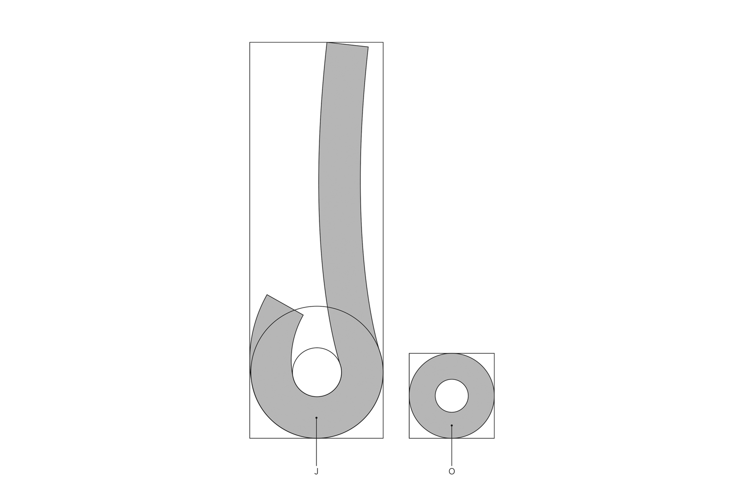
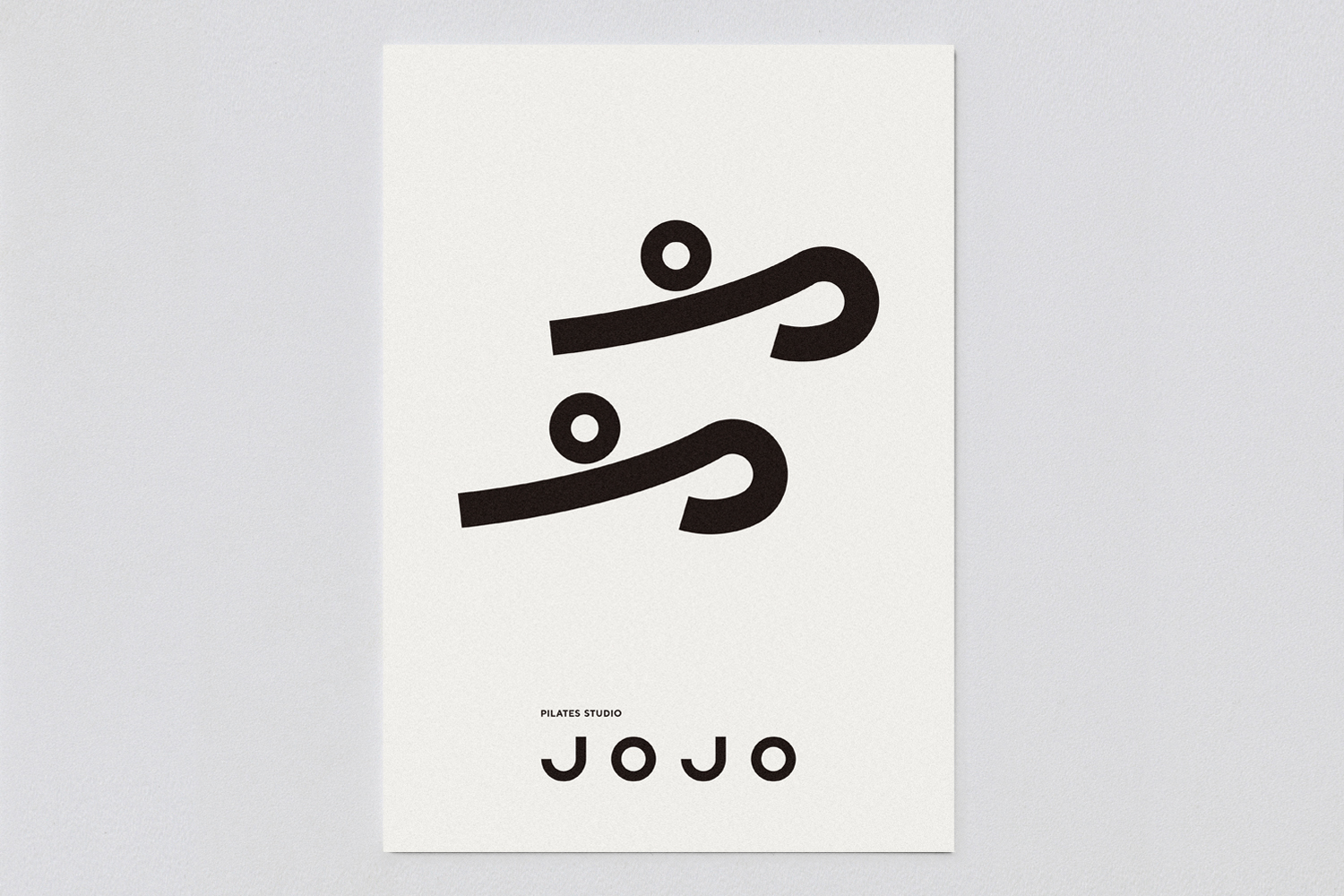
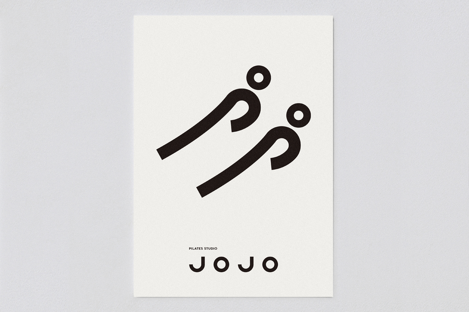
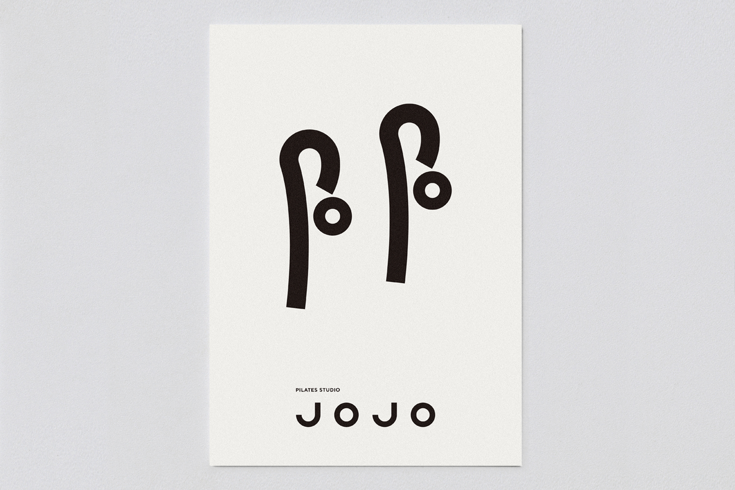
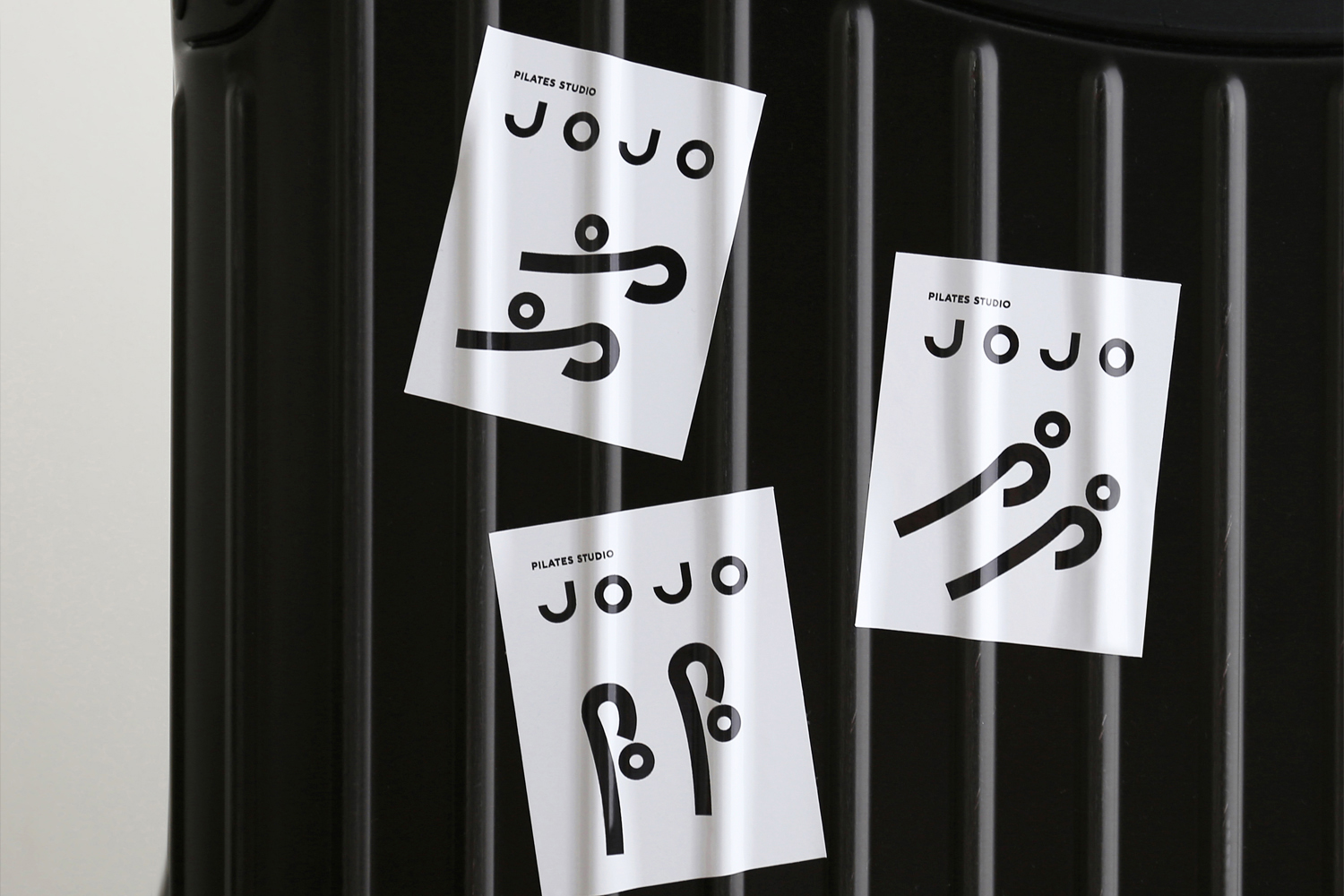
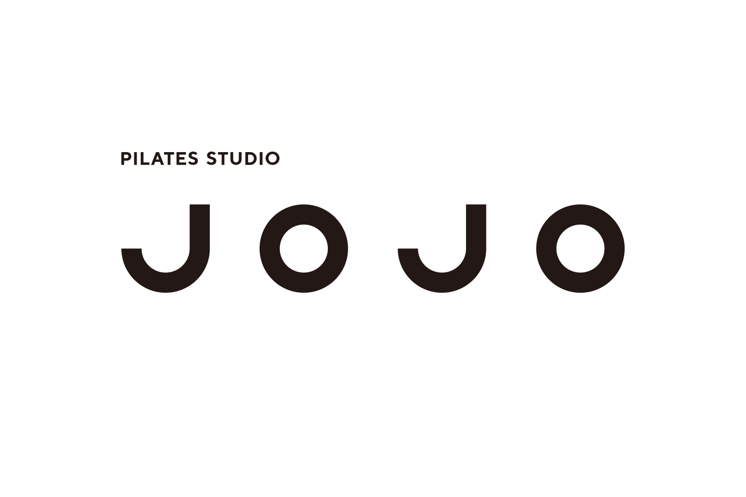
The logotype, composed with uniform stroke width and generous letter spacing, embodies a minimalist form that conveys a modern, honest sense of reassurance. As a communication icon, two people performing Pilates poses are represented by the letters “J” and “O” The humor lies in how simply changing the angle of the “J” creates a different pose—an expression that synchronizes with the joy and depth of Pilates.
Art Direction+ Design: Takeaki Shirai
Client: Studio JOJO @studio_jojo_
新潟市にオープンした、ピラティススタジオのブランドデザインをDESIGN DESIGNが担当しました。Studio JOJOはマシンピラティスとマットピラティスの完全プライベート型のスタジオです。理学療法士として20年間「身体と向き合う時間」に携わってきたインストラクターが一人ひとりの身体の特徴に合わせて丁寧にセッション。BASIピラティスと融合させ身体を根本から整えてくれます。リハビリや不調改善のための施術も行っています。
ブランドコンセプト「余韻嫋々」
音が止んだ後も、かすかに、そして長く響き続けるその様子。それは、優雅な心と身体を育み、望むことを、望むときに、望むだけ続けられる状態を保つことにつながる。
デザインコンセプト「常に万全な状態」
ロゴタイプは均一の太さと広い字間で構成したミニマルな形状はモダンで実直な安心感を与えてくれます。コミュニケーションアイコンとしてピラティスのポーズをする2人の人を「J」と「O」で表現した。「J」の角度を変えるだけで違うポーズになるというユーモアに、ピラティスの楽しさや奥深さをシンクロさせた。