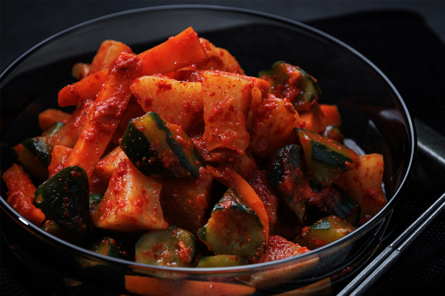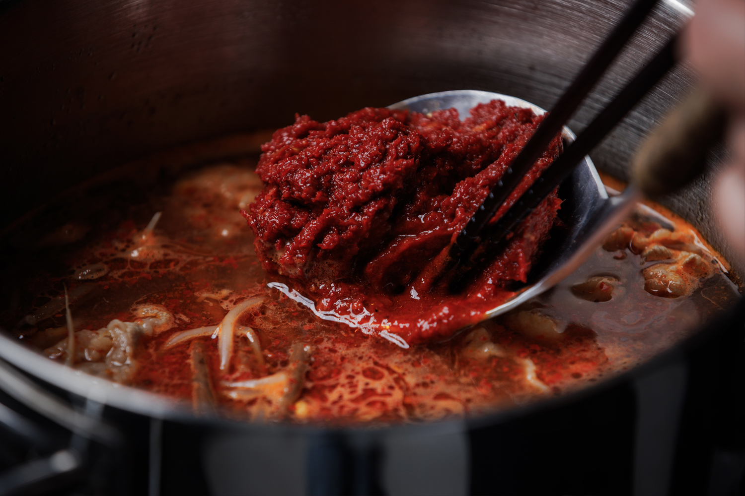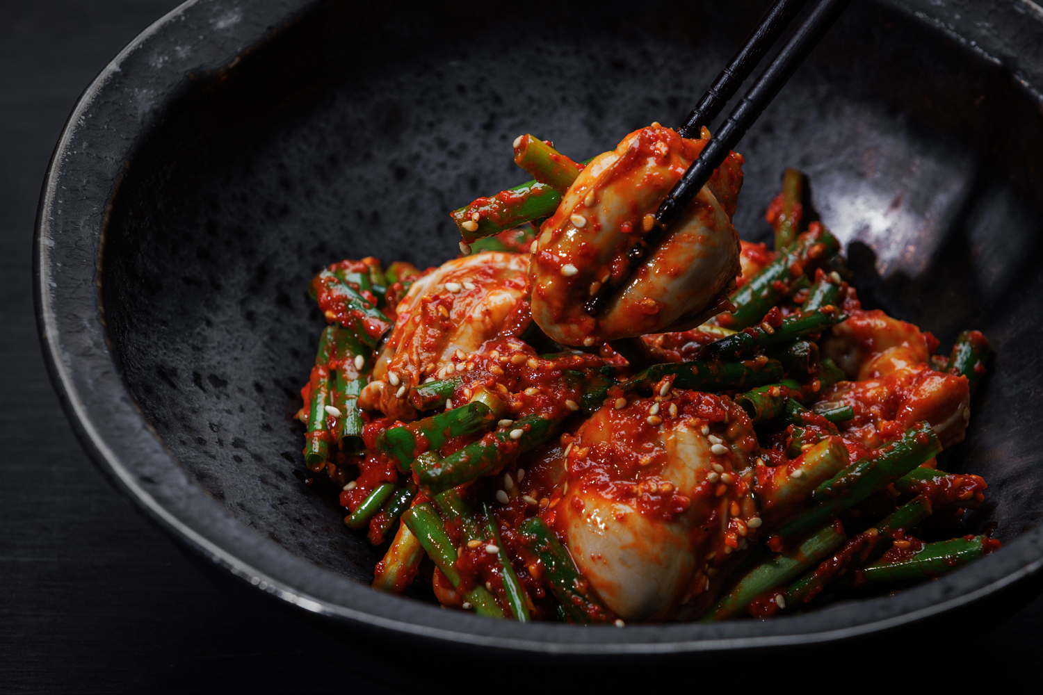
Kimchi Shop VI (concept, logo, packaging, leaflet etc.)
Stylist Shima Yamada has opened a handmade kimchi shop in Niigata, and we handled the visual identity design
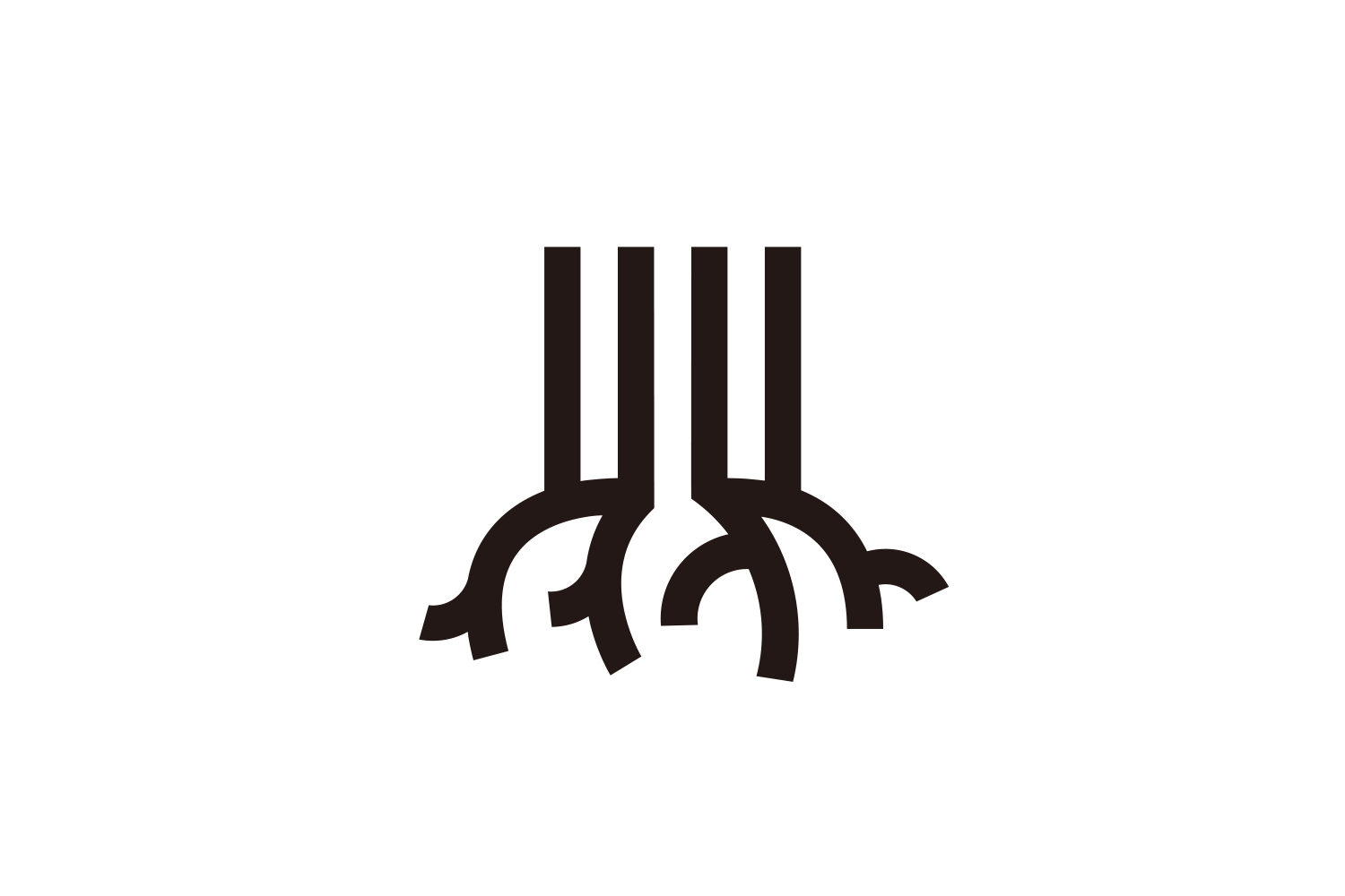
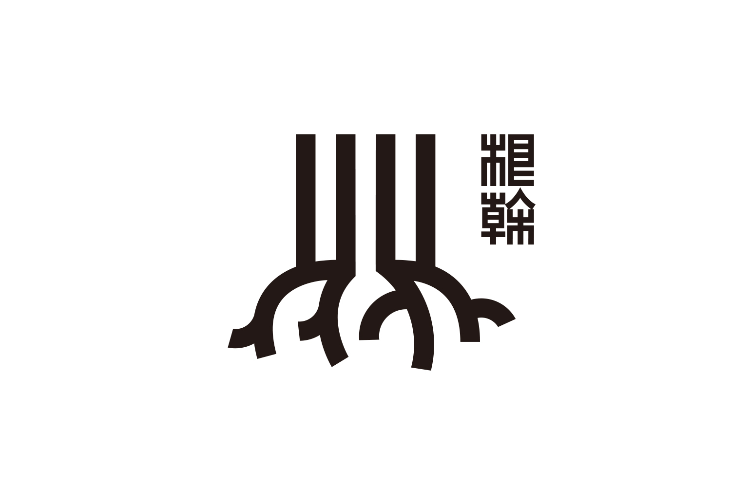
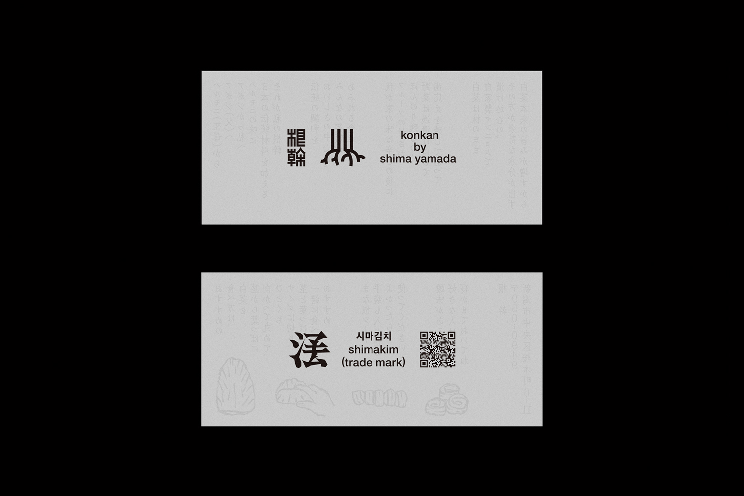
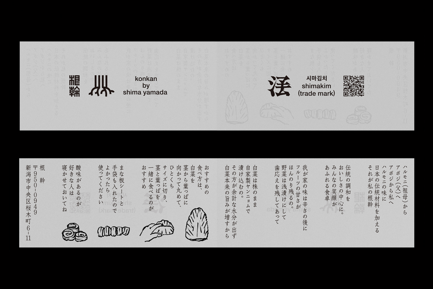
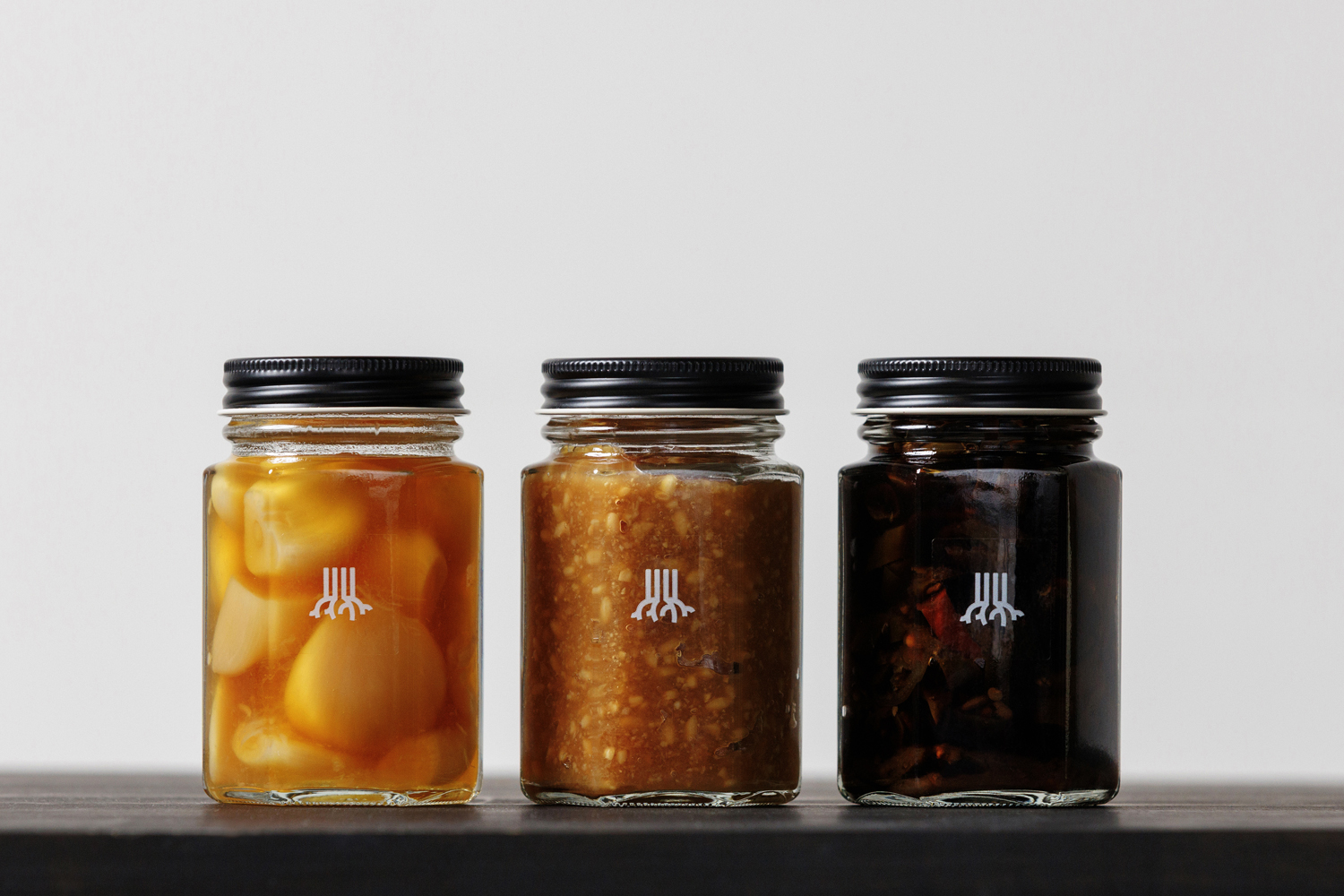
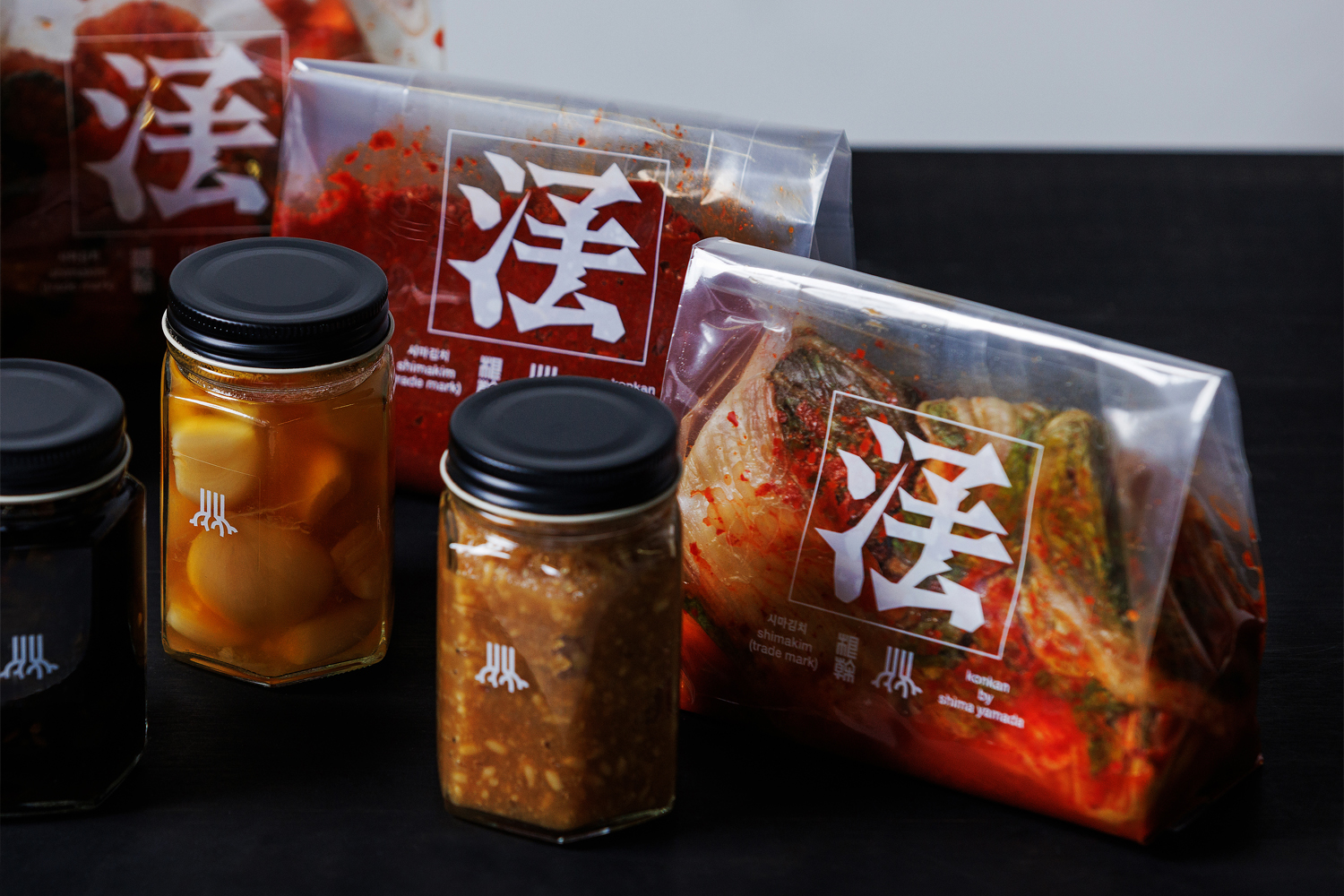
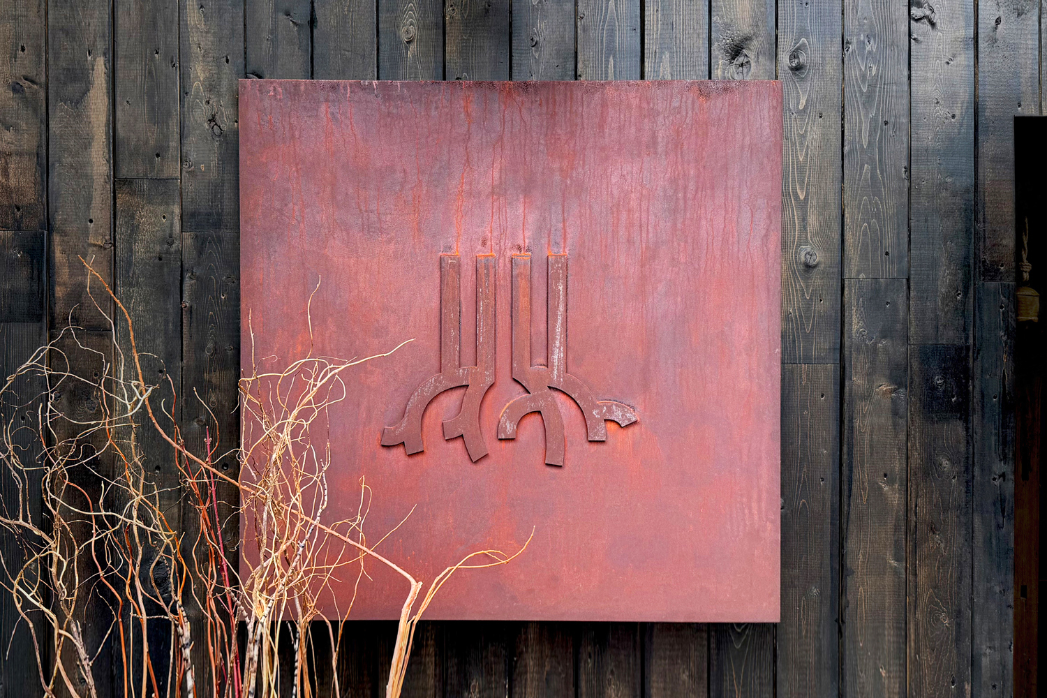
The symbol mark is a stylized representation of the brand name. The trunk growing from the roots is expressed with a bold line, emphasizing an authentic impression.
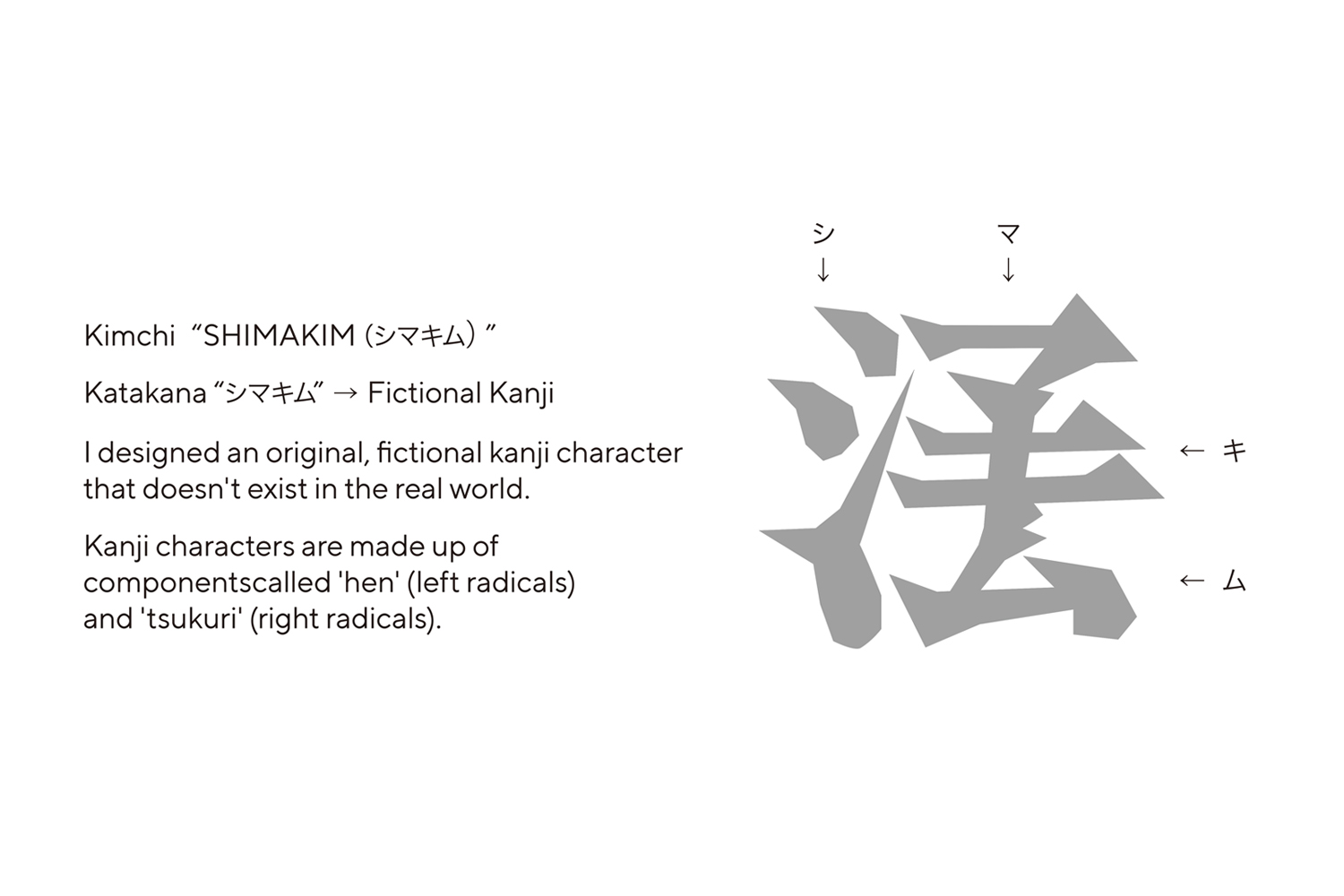
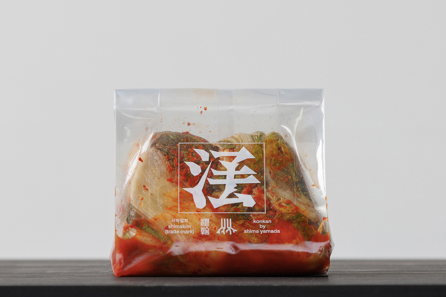
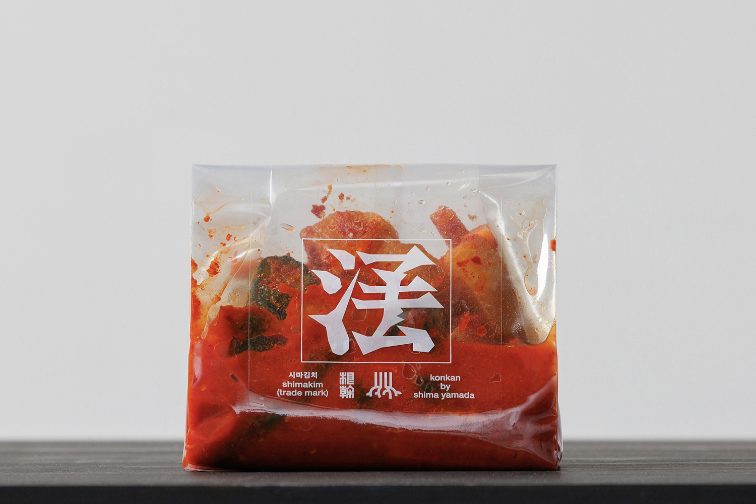
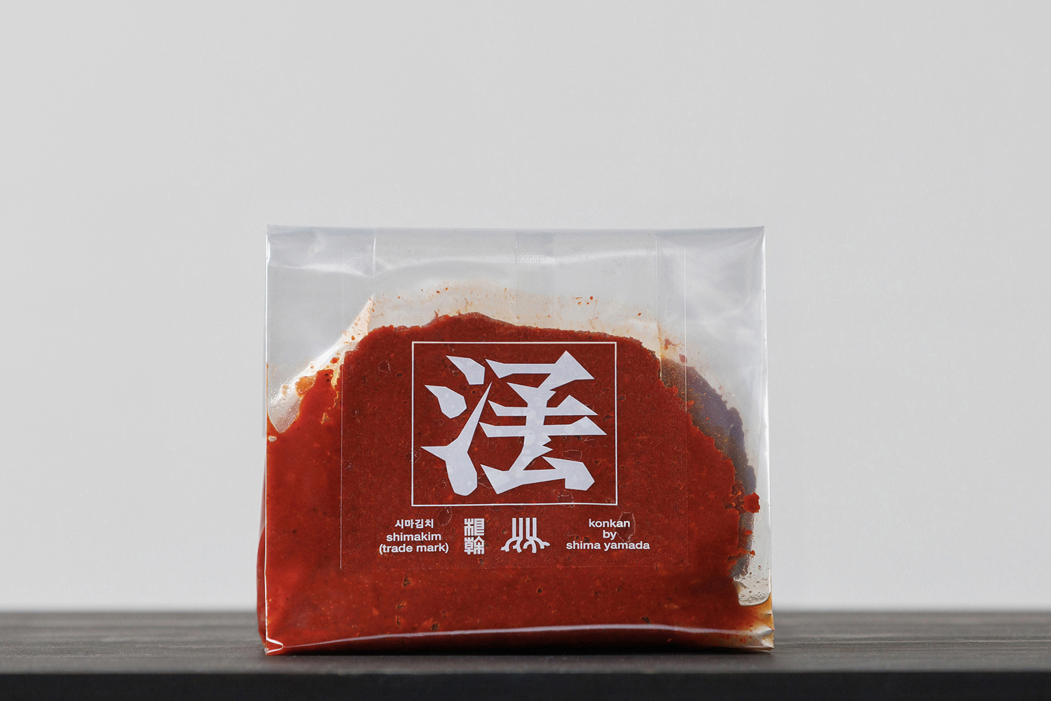
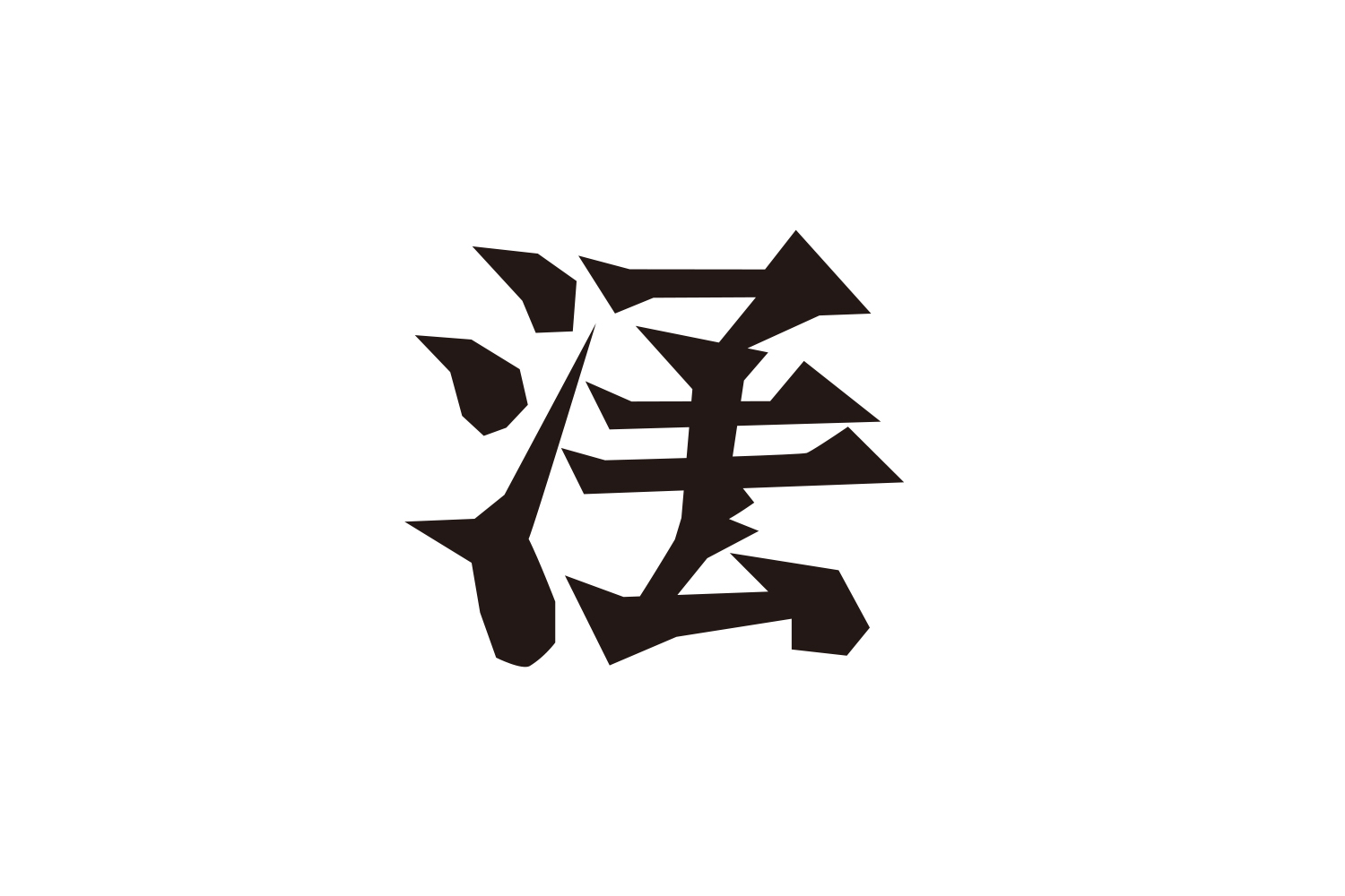
We also developed the logo for our signature product, the kimchi series "Shimakim." Placing importance on the roots of Shimakim, which stem from a harmony between Korean and Japanese traditions, we focused on characters (kanji) that evoke a sense of origin, and created a completely new kanji that doesn't exist. The four katakana characters of "Shimakim" were used to construct it: "シ" ("Shi") forms the left radical, while "マキム" ("Makimu") forms the right part of the character, resulting in a single, original kanji representing "Shimakim."
As a result, a one-of-a-kind visual identity design was born.
スタイリストの山田志麻さんが新潟に手づくりキムチの店舗をオープン。DESIGN DESIGNはVIデザインを担当しました。店名は根幹。ブランドコンセプトは「伝統の調和をおいしさの中心に。」。シンボルマークはブランド名をデザイン化。根から伸びる幹を太い線で表現。オーセンティックな印象を強調させた。看板商品であるキムチシリーズ「シマキム」のロゴも開発。韓国と日本の伝統の調和からなるシマキムのルーツを重要と考え、ルーツを想起させる文字(漢字)に着目し存在しない新しい漢字を作字した。「シマキム」のカタカナ4文字を使い、「シ」は「へん」に、「マキム」を「つくり」に使用し、シマキムという一つの漢字が誕生した。結果、唯一無二のVIデザインとなった。