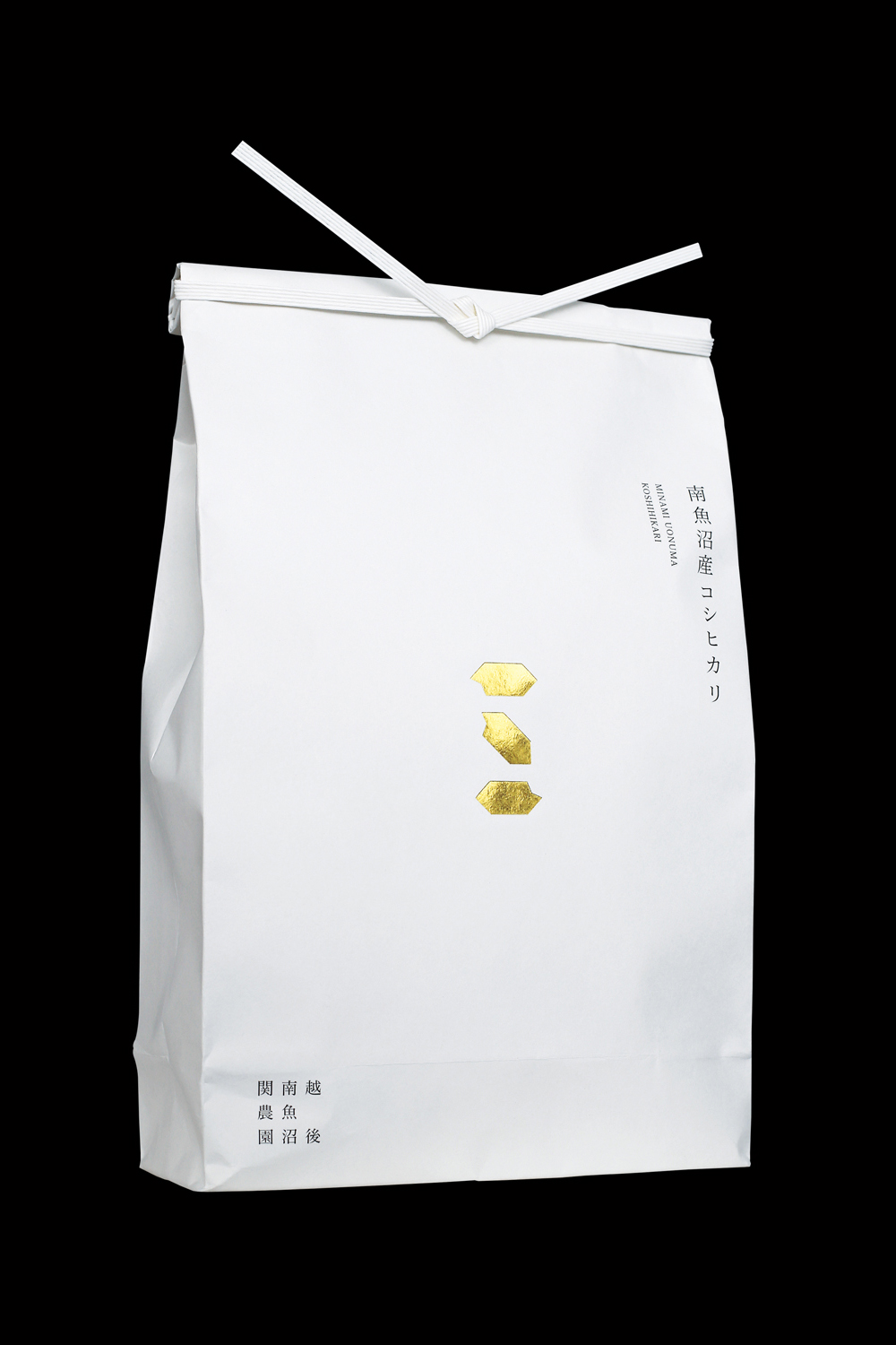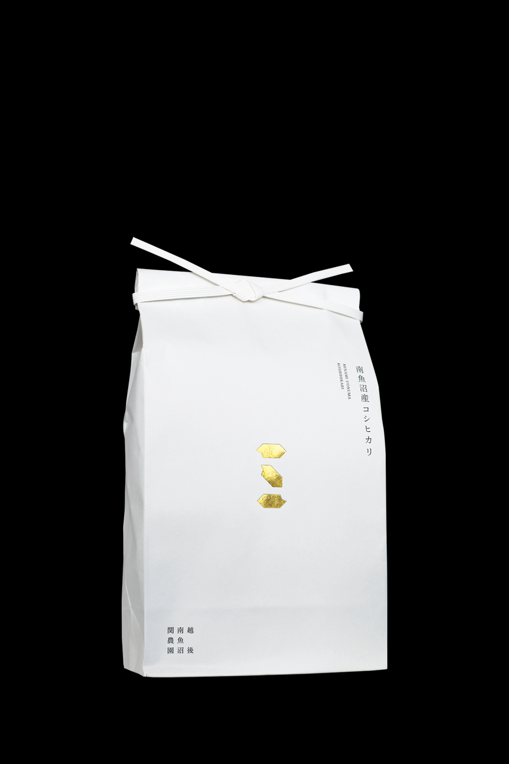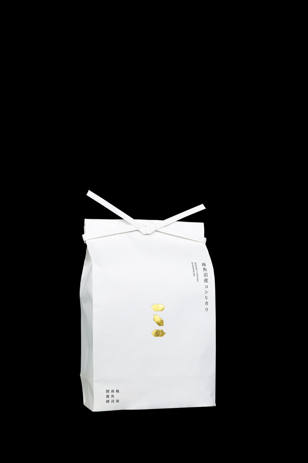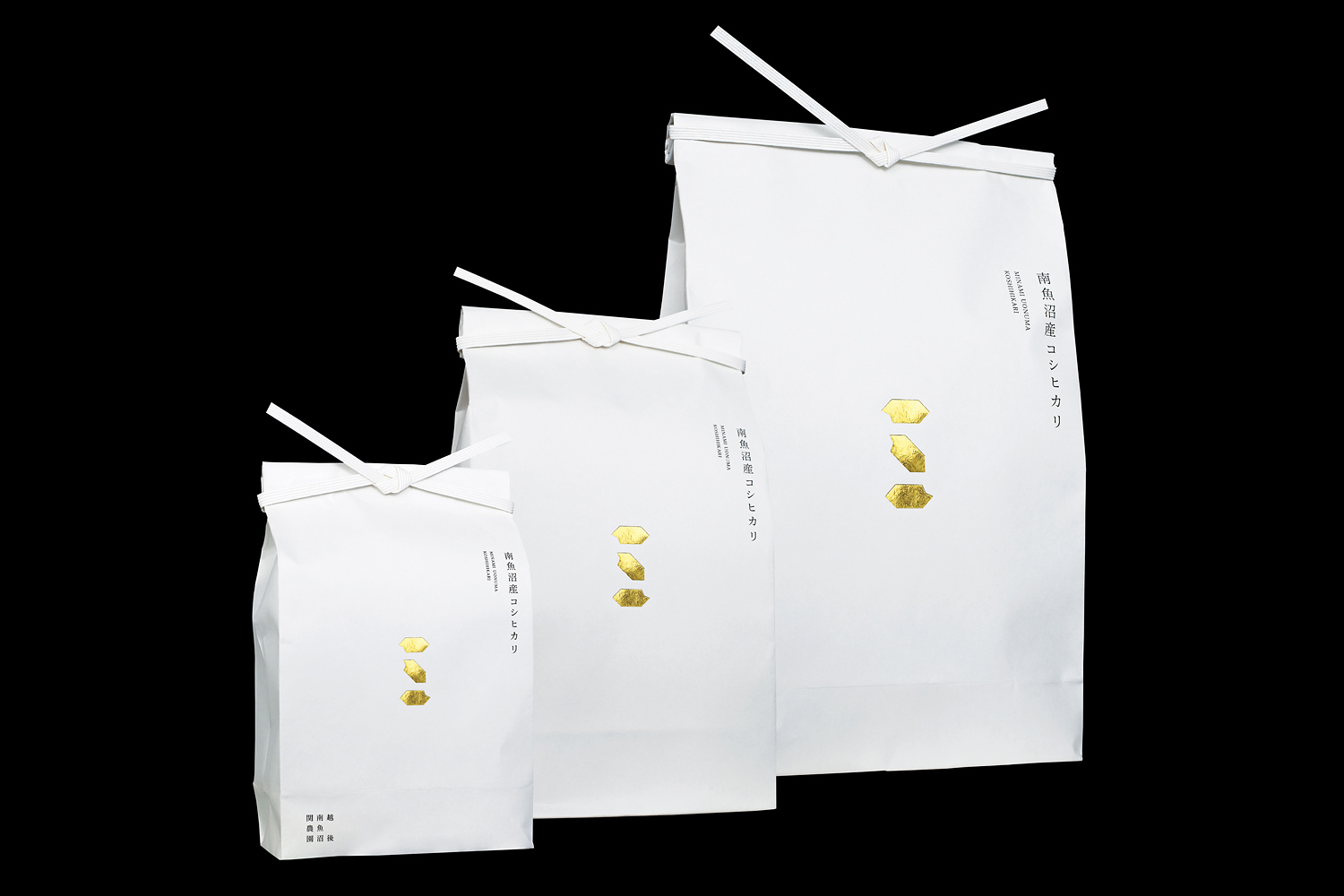
Renewal of the packaging of rice bags for rice grown with reduced agricultural chemicals, which has won the gold medal in the Taste of Rice competition for six consecutive years. With demand for the product as a gift, the design was redesigned to enhance the brand value of the farm and uplift the spirits of those who buy and receive the product, with the goal of making the rice the best tasting rice in Japan.
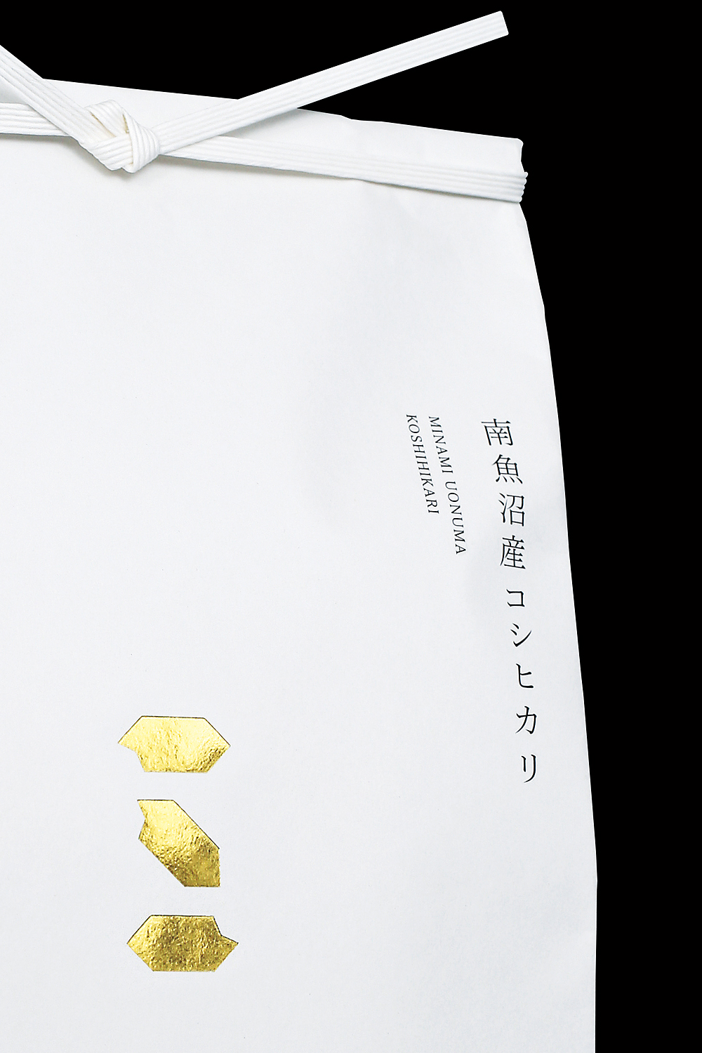
The initial "S" of Seki Noen is represented by a grain of rice. The simple graphic, which makes full use of the blank space, embodies Seki Noen's commitment to rice production.
6年連続で旨みのコンクールで金賞を受賞している減農薬栽培米の米袋のパッケージをリニューアル。贈答用としての需要もあり、日本で一番美味しいお米を目標に掲げ、農園のブランド価値を高め、買った人や贈られた人に高揚感を持ってもらえるようなデザインにリニューアル。
関農園のイニシャル「S」を米粒で表現した。余白を活かしたシンプルなグラフィックは関農園の米づくりへのこだわりを体現している。