At the “D & AD Design Awards 2021”, the international design advertising award with the strictest screening and reputation in the world, the brand design of “Seki Farm” won the “Graphite Pencil (Silver Award)” in the Packaging Design / Rebrand category.
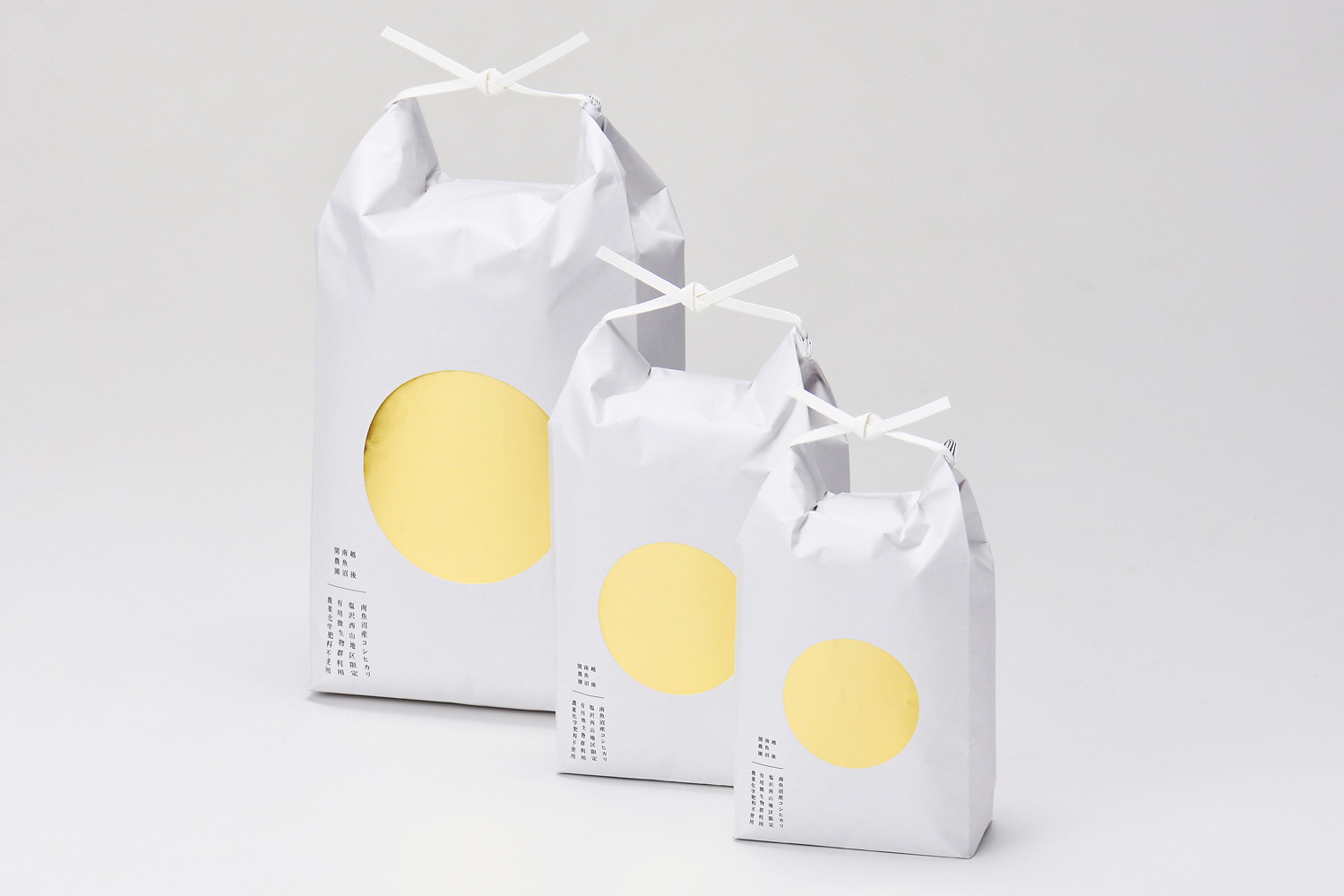
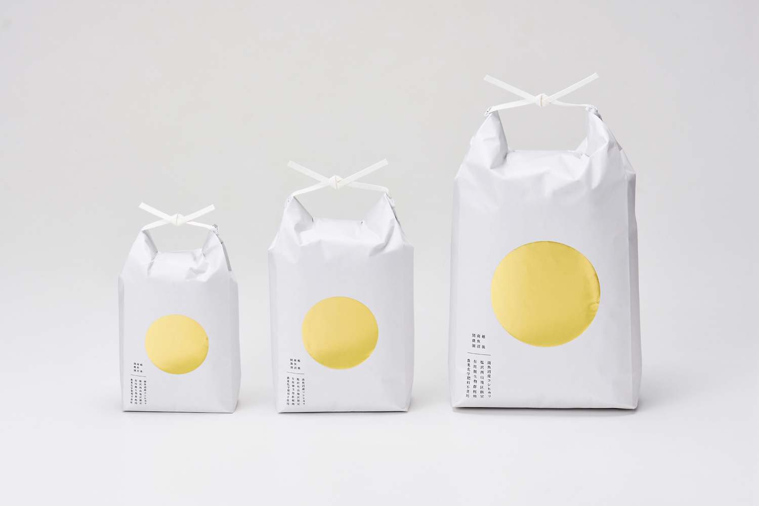
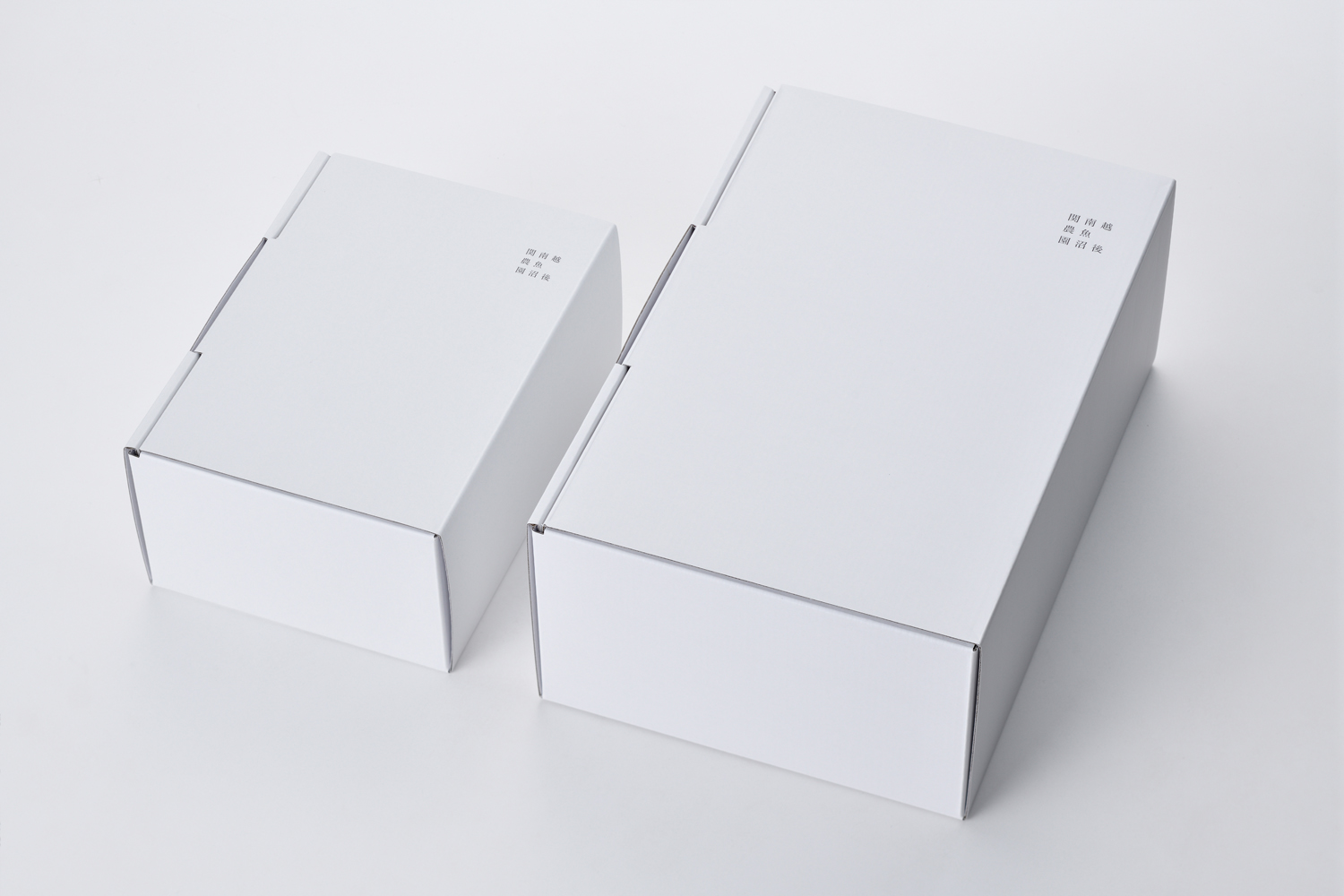
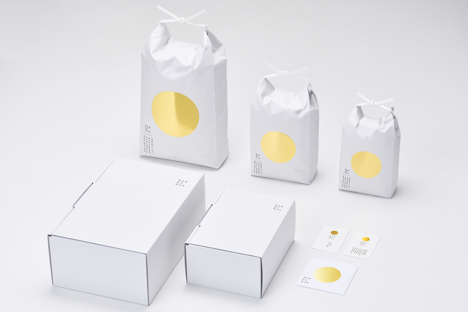
Renewal of rice package that won the gold medal in the taste of the competition for the sixth consecutive year. There is also demand for gifts, and the brand value of the farm as the highest quality rice in Japan has been increased, and the design has been redesigned so that the buyers and recipients will feel uplifted. The simple, powerful and elegant design expresses the dignity of being the best rice in Japan and the strength of winning a gold medal.
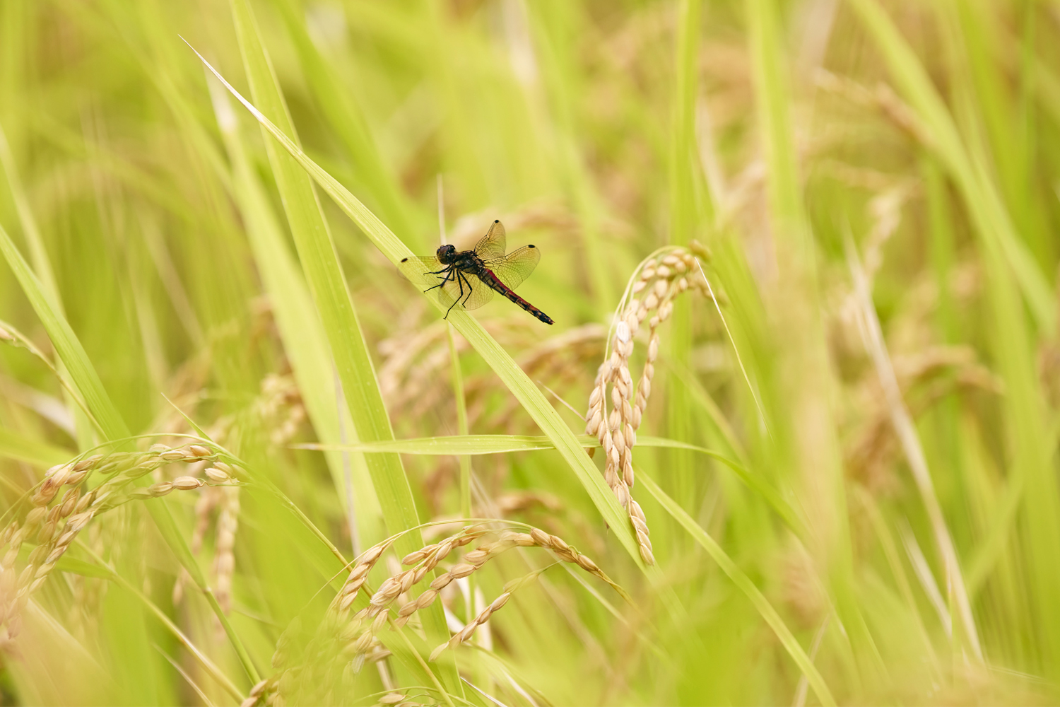
The rice is grown without pesticides and chemical fertilizers, and the cultivation method is very particular, and it has won many gold medals. However, in the past, the rice was not packaged in a way that conveyed its character. The renewal of the rice was aimed at increasing the brand value of the rice as the most expensive rice in Japan, as it is also in demand as a souvenir and gift.
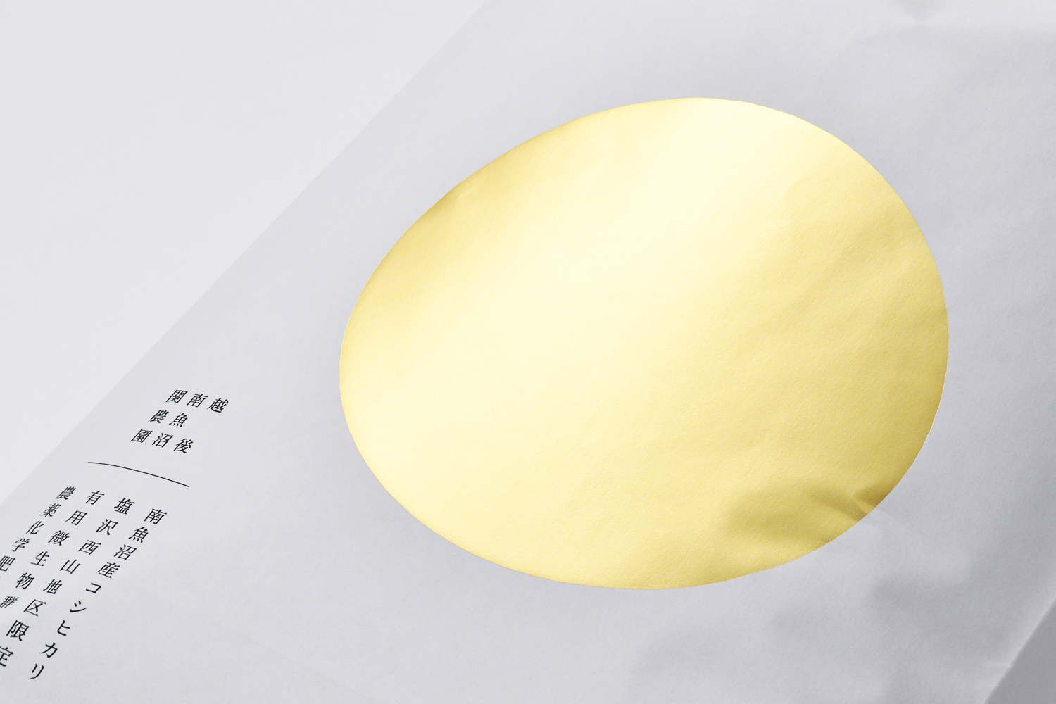
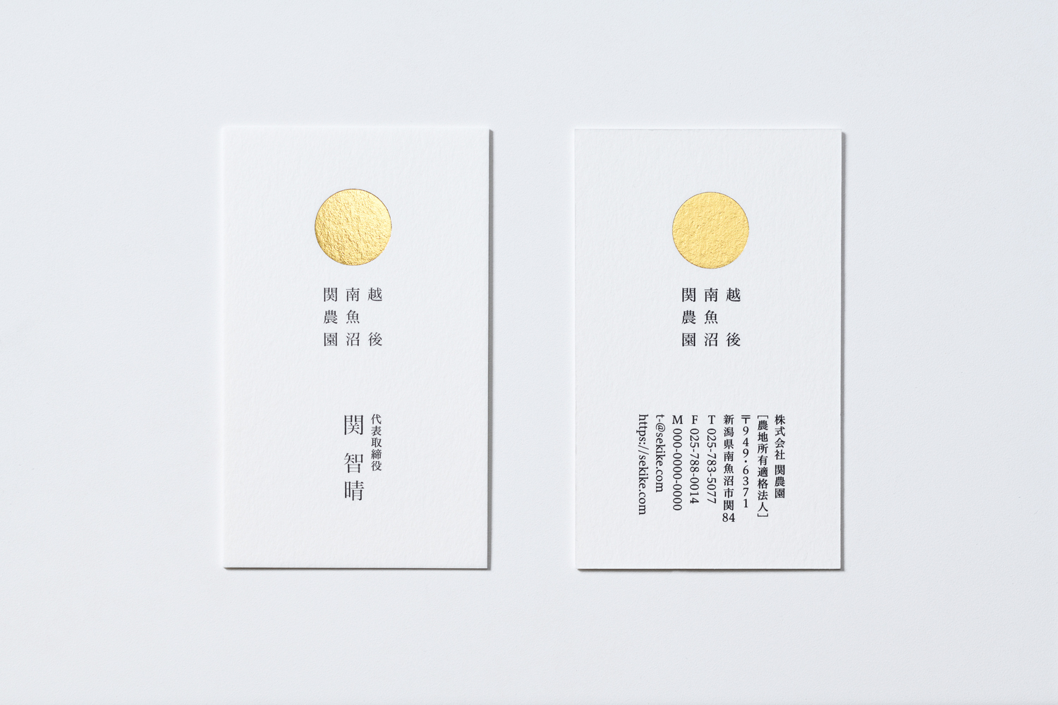
We designed to evoke the image of the most delicious rice in Japan. Before it relied on the brand of "Uonuma" as a place of delicious rice, but we made the farm's personality the brand power. The design is simple, and powerful expressing the dignity of a rice champion. The circle, which looks like a gold medal, also reflects the commitment of the producer, a former professional snowboarder.
Rice bags are made of paper. In the past, the material was too thick and strong, so we switched to thin and strong kraft paper, considering the environmental impact.
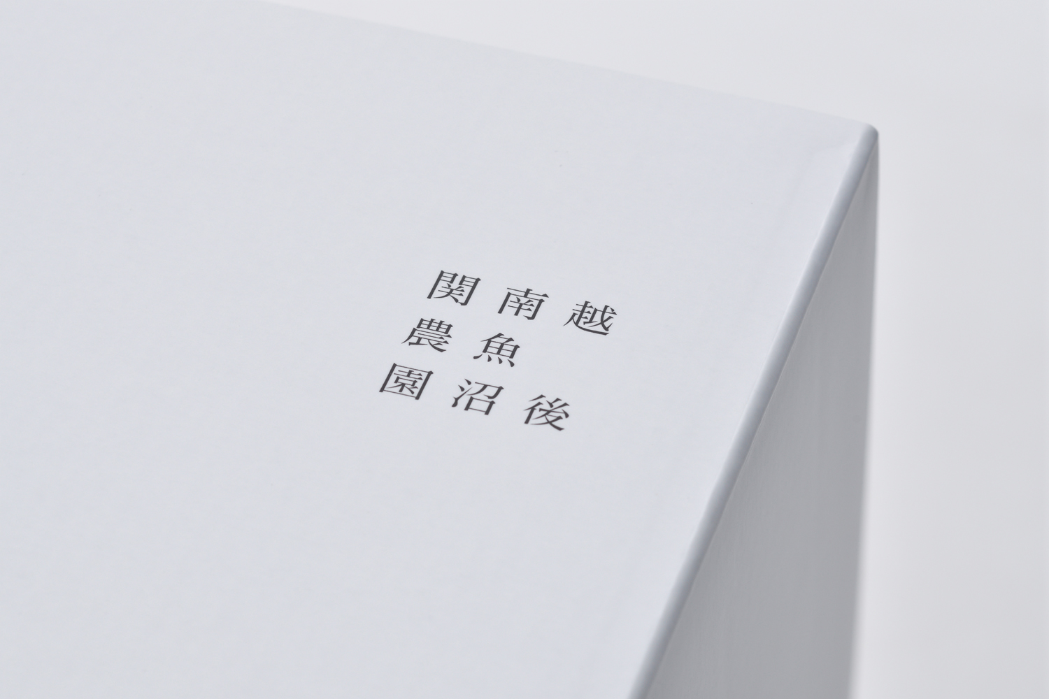
This rice is grown in the "Shiozawa area of Minamiuonuma City, Niigata Prefecture. This area has a strong brand as a place where particularly delicious rice is grown in Japan. The circle in the package is also read as "en" in Japanese, meaning a connection with people or a place where people and animals gather.
世界で最も厳しい審査と定評のある国際的なデザイン広告賞「D&AD Awards」にて、「関農園」のブランドデザインがPackaging Design/Rebrand部門で「Graphite Pencil(銀賞)」を受賞しました。
6年連続で旨みのコンクールで金賞を受賞しているお米のパッケージをリニューアル。贈答用としての需要もあり、日本で一番高級な米としての農園のブランド価値を高め、買った人や贈られた人に高揚感を持ってもらえるようなデザインにリニューアル。シンプルで力強く、上品なデザインにすることで、日本一のお米であるという品格と金メダルをとった力強さを表現している。
無農薬・化学肥料不使用で、栽培方法にも十分にこだわり、何度も金賞を受賞という評価も高い米だが、以前はパッケージでその風格を表しきれていなかった。今回のリニューアルではお土産、贈答用としての需要もあり、日本で一番高級な米としてのブランド価値を高めることが課題。
日本一美味しいお米をイメージさせるデザインにしました。以前は、おいしいお米の産地としての「魚沼」のブランドに頼っていましたが、農場の個性をブランド力にしました。デザインはシンプルかつ力強く、お米のチャンピオンの威厳を表現しています。また、金メダルをイメージした円には、元プロスノーボーダーである生産者のこだわりが込められています。
米袋の素材は紙製です。以前は厚く丈夫すぎる材質だったため、環境負荷も考え、薄くて丈夫なクラフト紙に変更しました。
このお米が作られている地域、「新潟県南魚沼市塩沢地区」は日本の中でも特に美味しいお米が栽培できる地域としてブランド力があります。モチーフになっている丸は日本語で「えん」とも読み、その言葉には人との繋がり、人や動物が集まる場所という意味も持っています。
※越後/Echigo is the former name of the country, referring to today's Niigata Prefecture.
※南魚沼/Area of Minamiuonuma City.