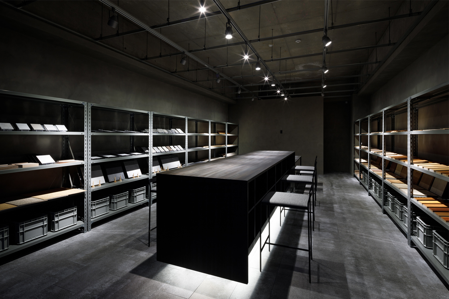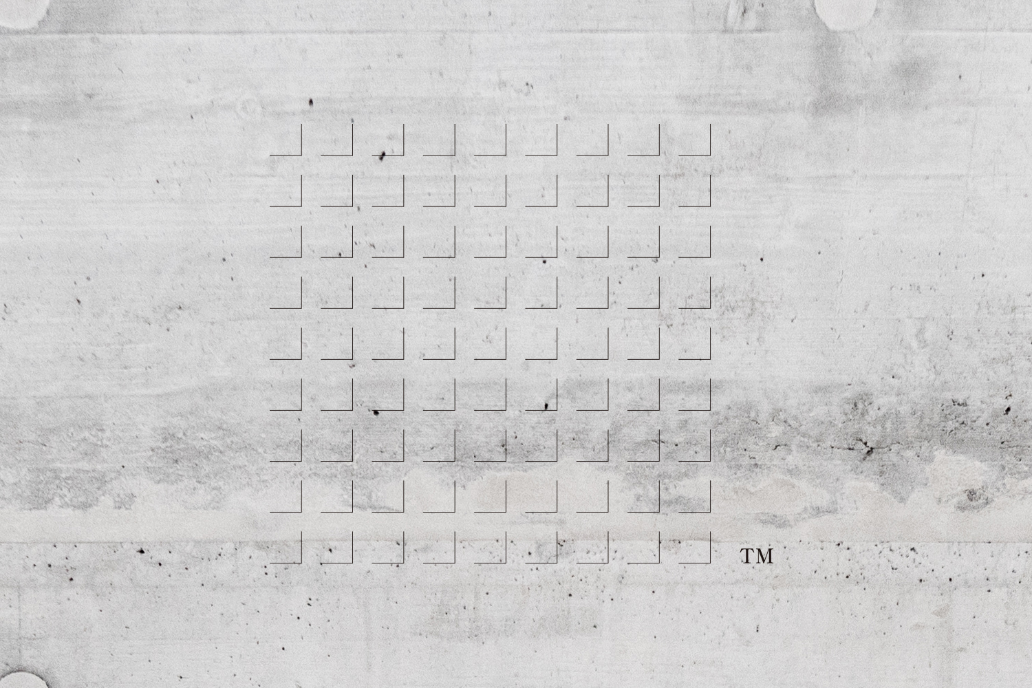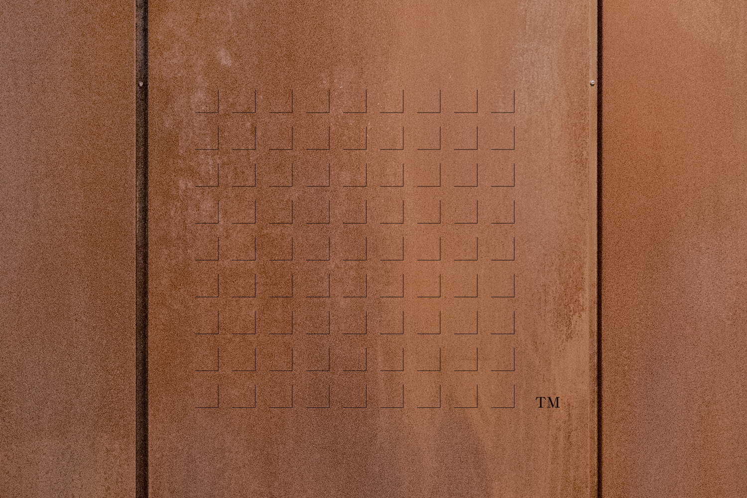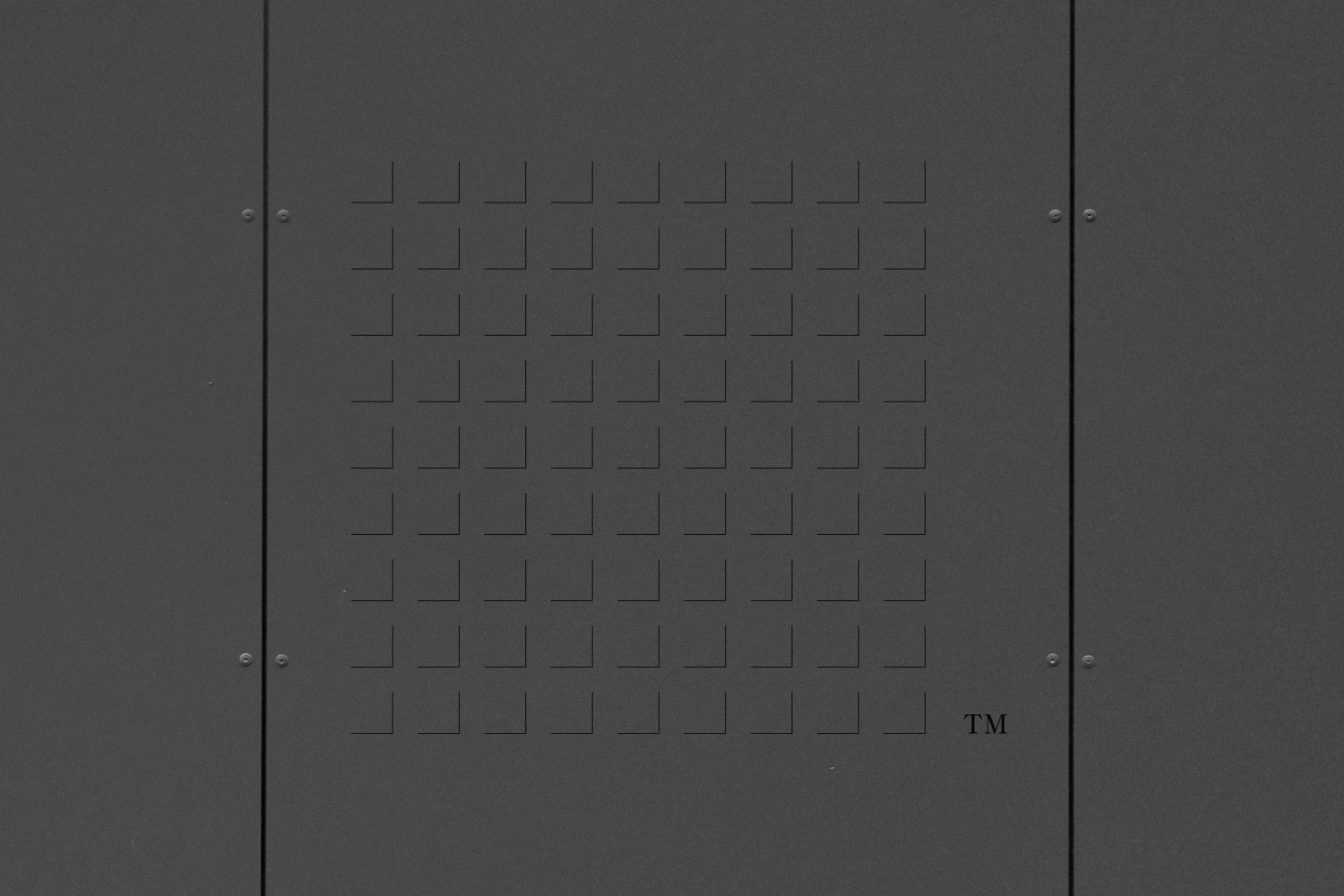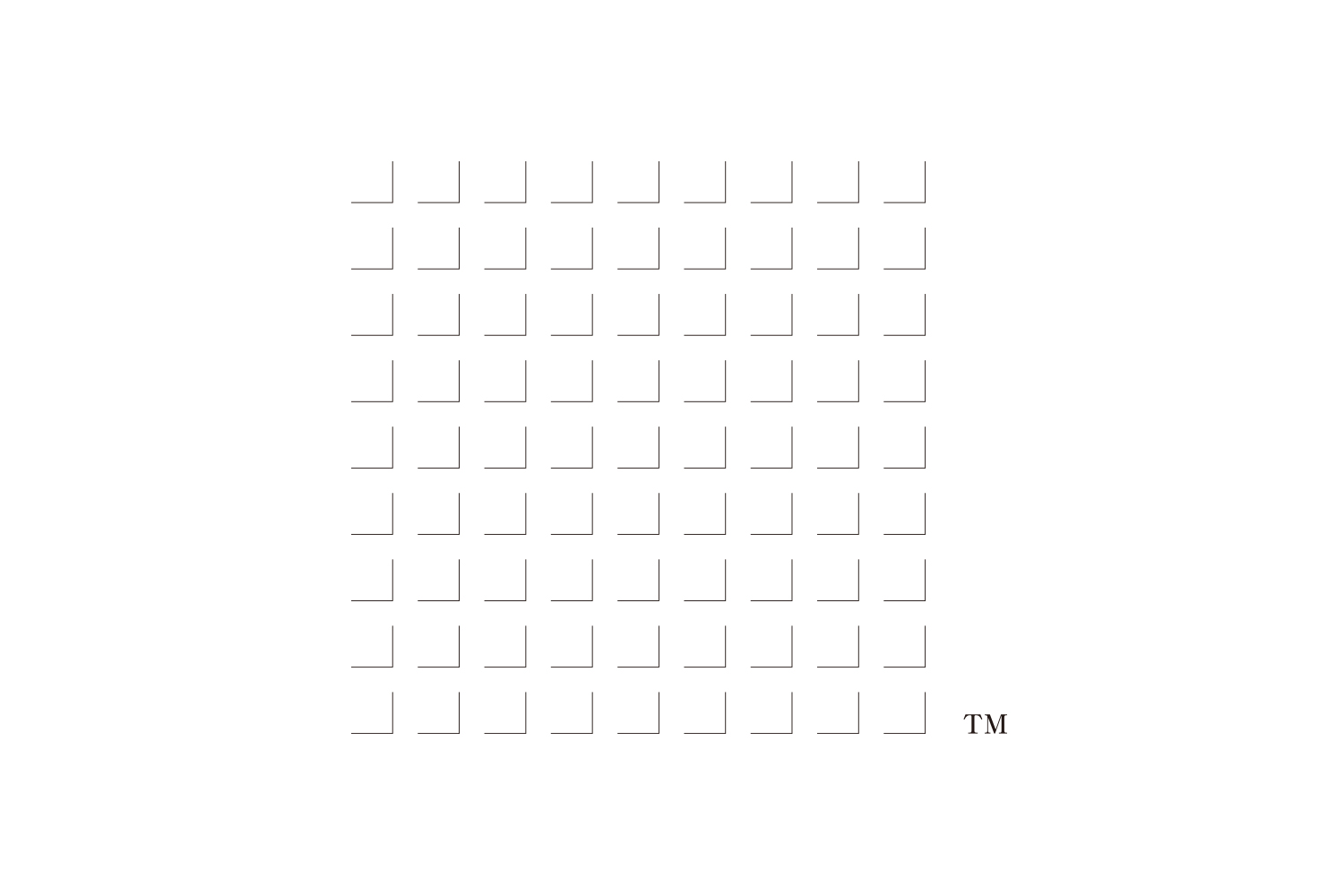
Developed the name and logo of the showroom that collected building material samples. The naming method was a word game that was easy to remember and understand. Since the showroom focuses on the materials that are the visual elements of the space design, the logotype was developed with a focus on simple and inorganic so that the design does not look over-designed so as not to give a biased image in one direction. The symbol mark expresses the appearance of a collection of square building material (material) samples using only L-shaped shadow lines. It is a transparent / variable mark that changes in various ways depending on the material of the wall on which the symbol mark is posted.
建材サンプルを集めたショールームのネーミングとロゴを開発。ネーミングは覚えやすくてわかりやすいものとして言葉遊びの手法を用いた。空間デザインのビジュアル要素である素材に絞ったショールームなので、ロゴタイプは一方向への偏ったイメージを与えないよう、デザインしすぎないデザインに見えるよう質素・無機質を意識して開発した。シンボルマークは四角い建材(素材)サンプルが集合した姿をL字のシャドウ線だけで表現した。シンボルマークを掲出する壁の素材によって様々な見え方に変化する透過性・可変性マークになっている。