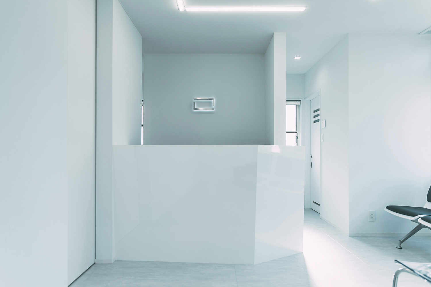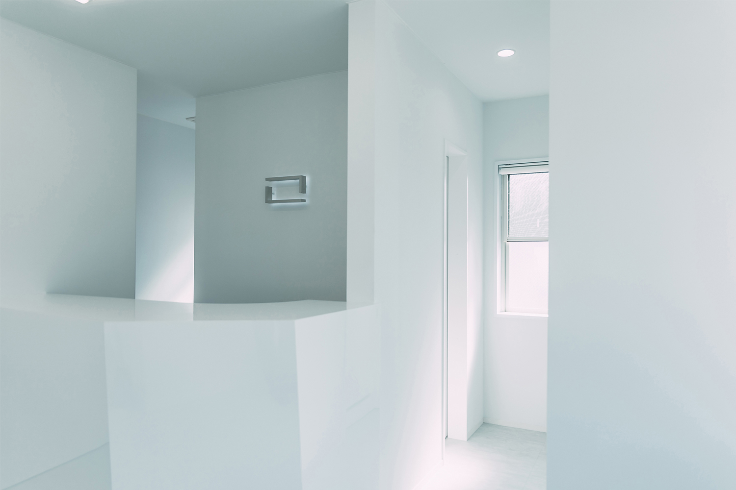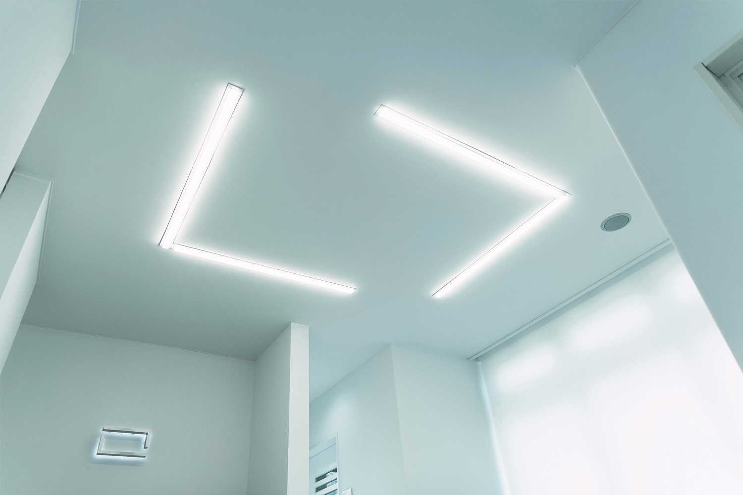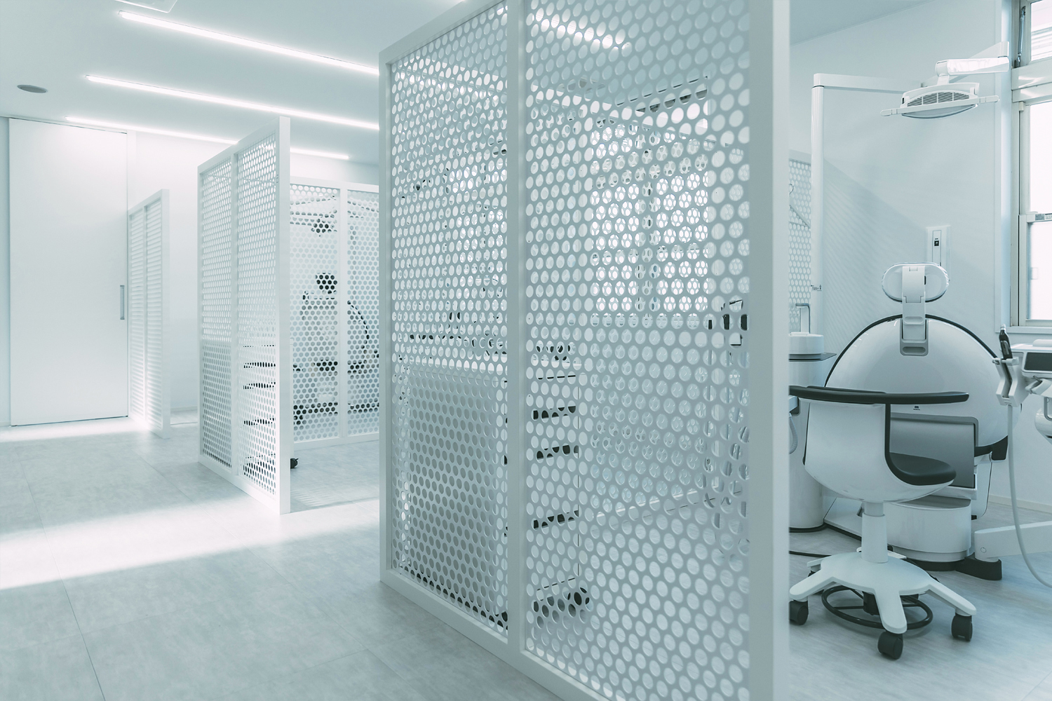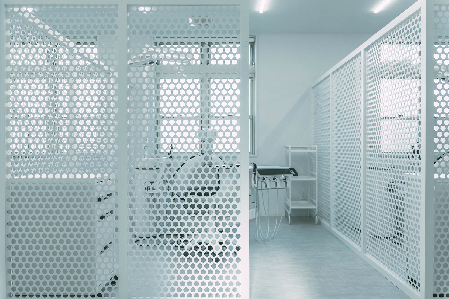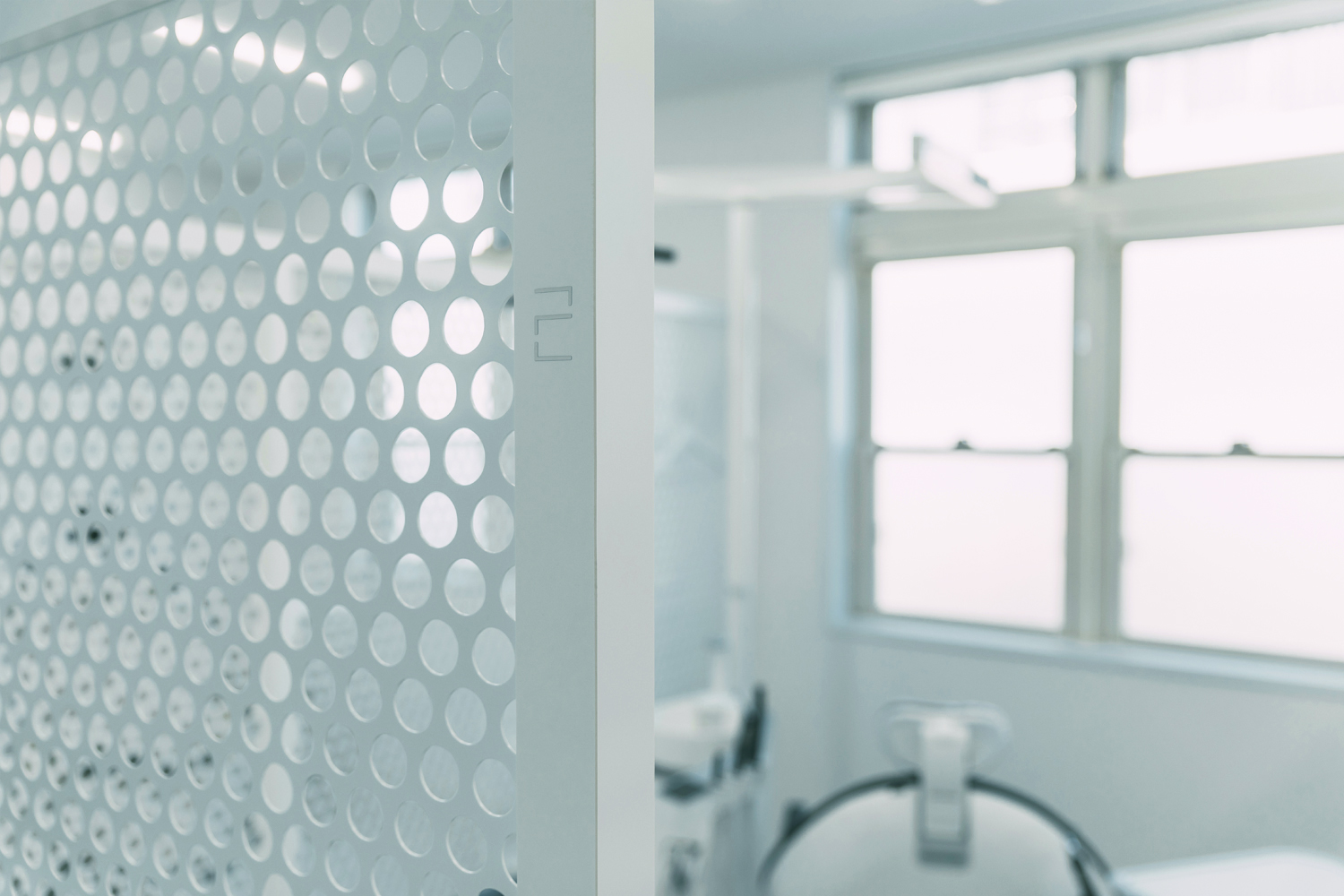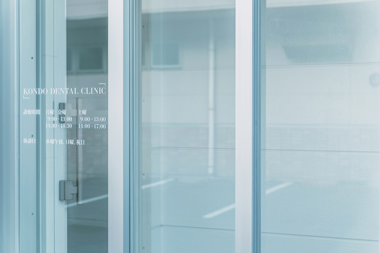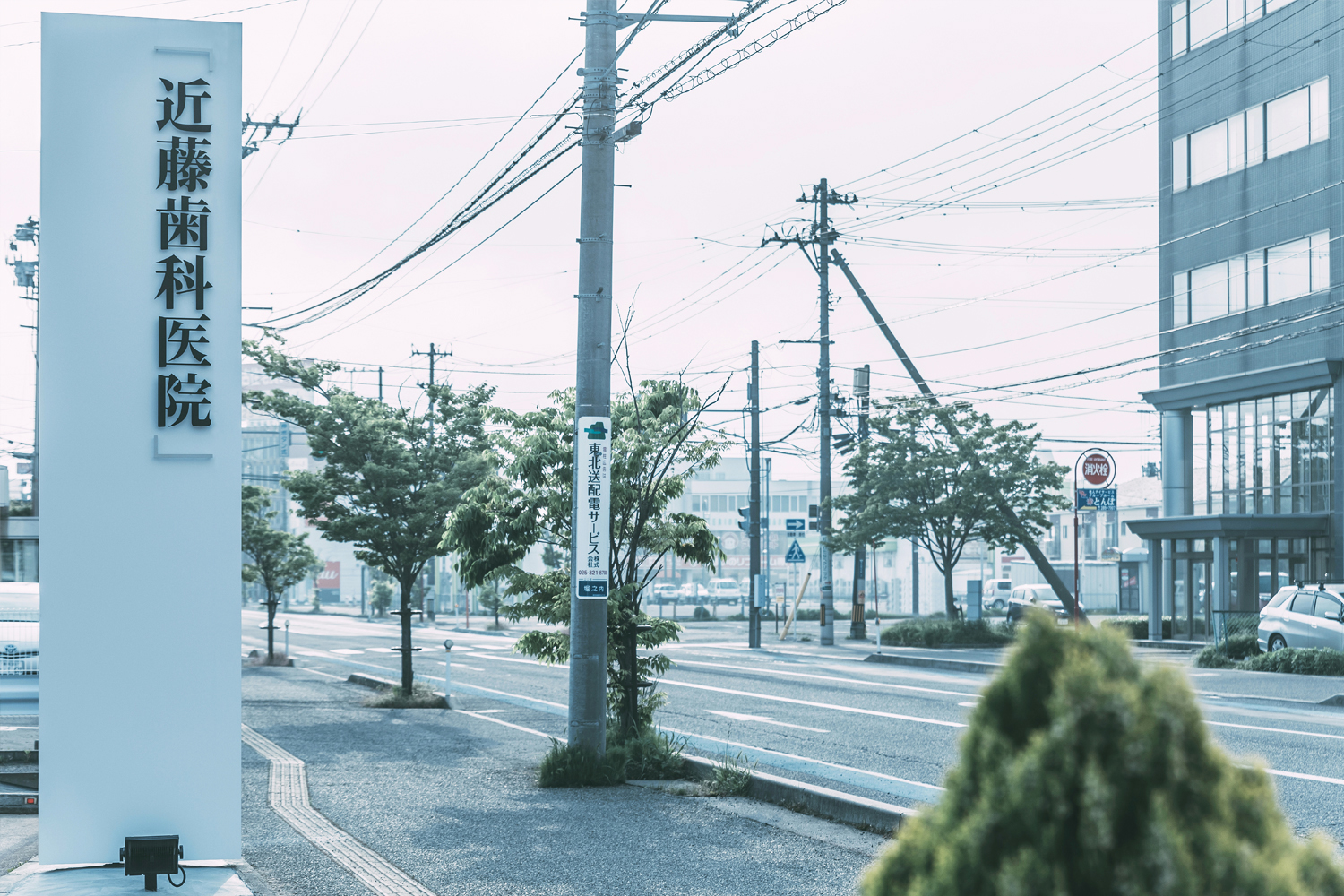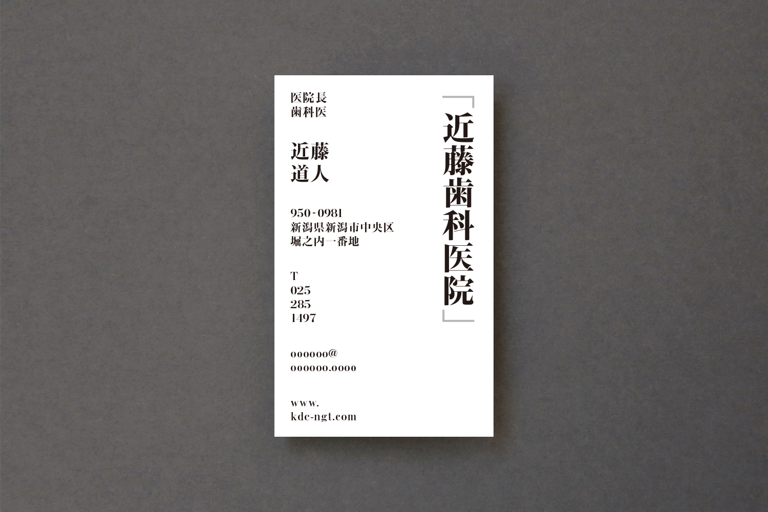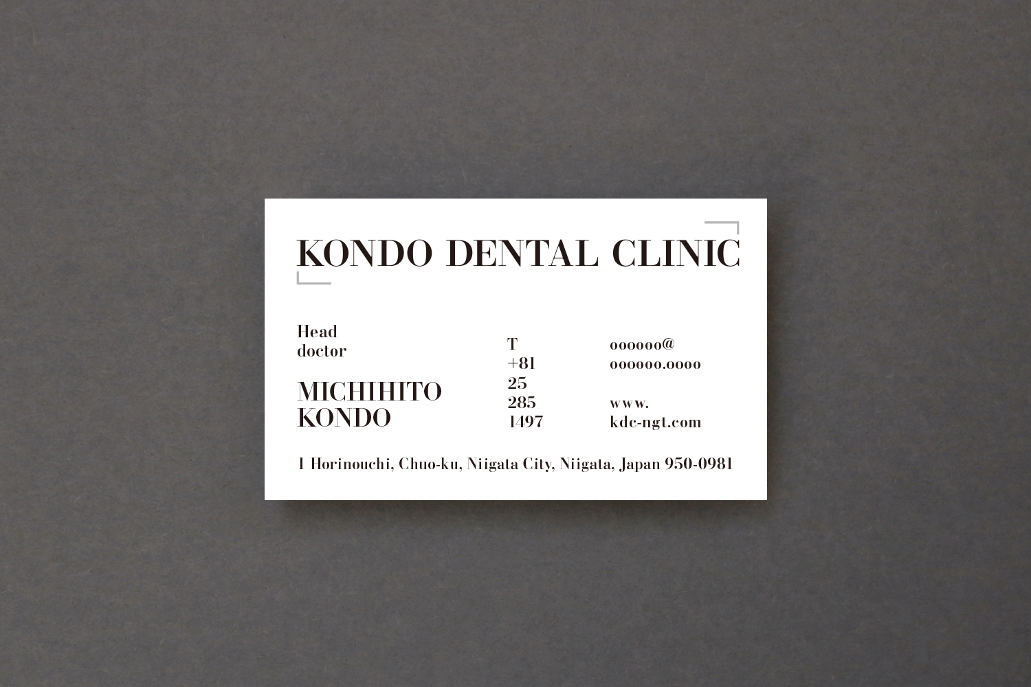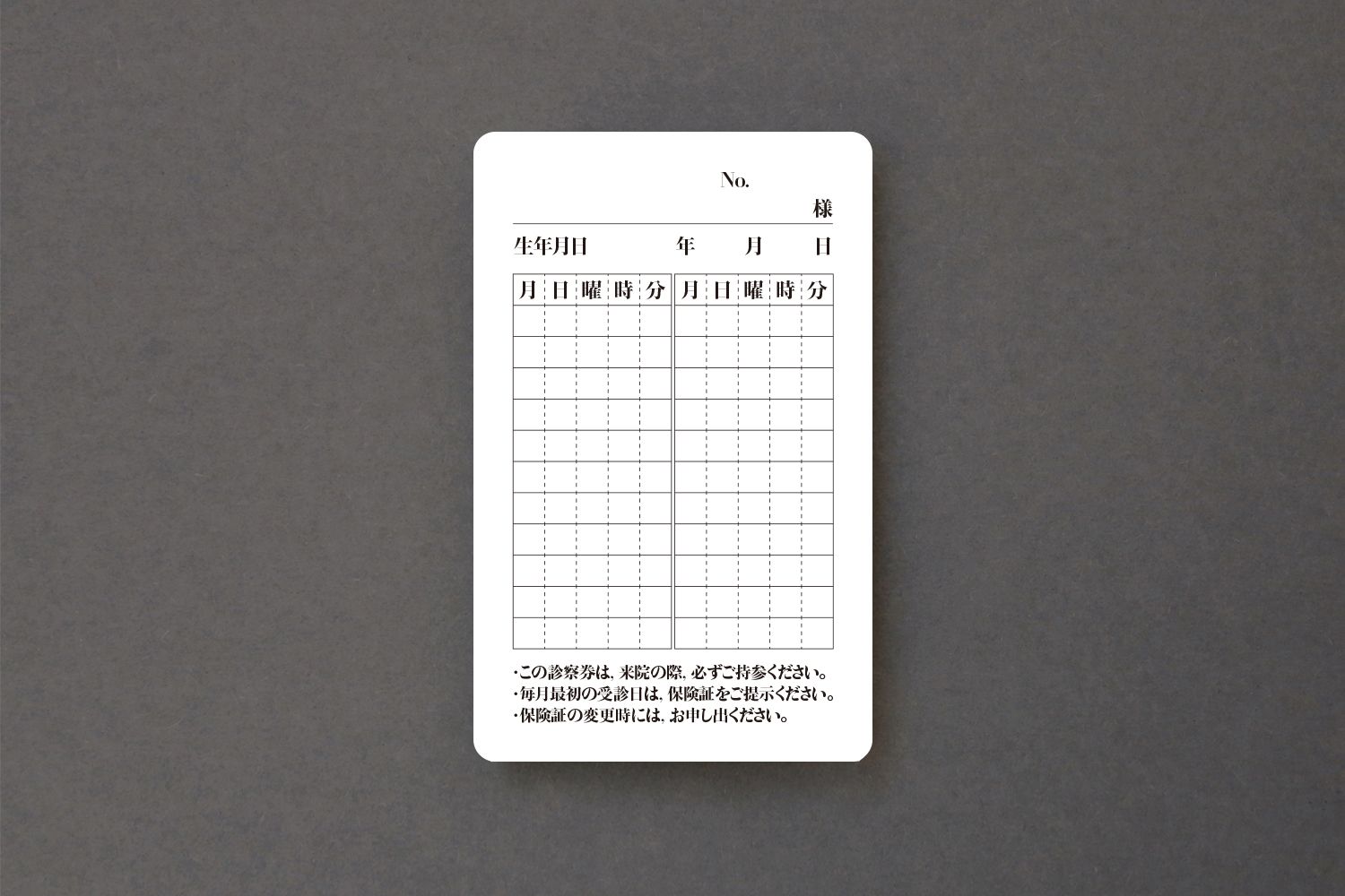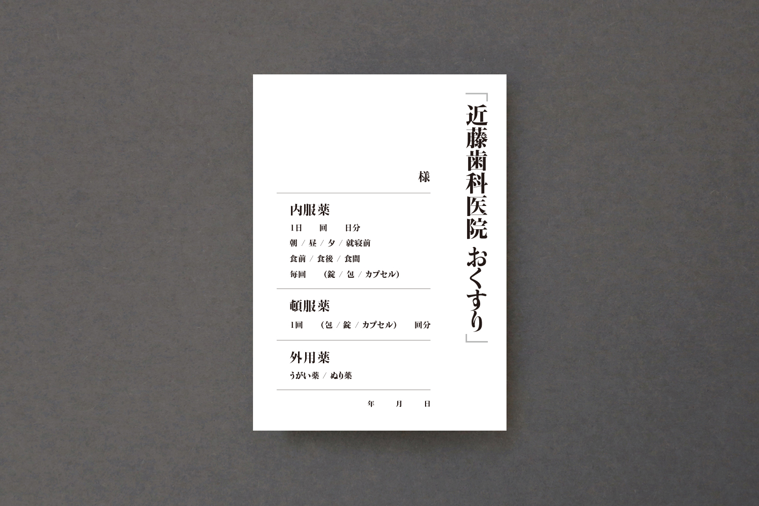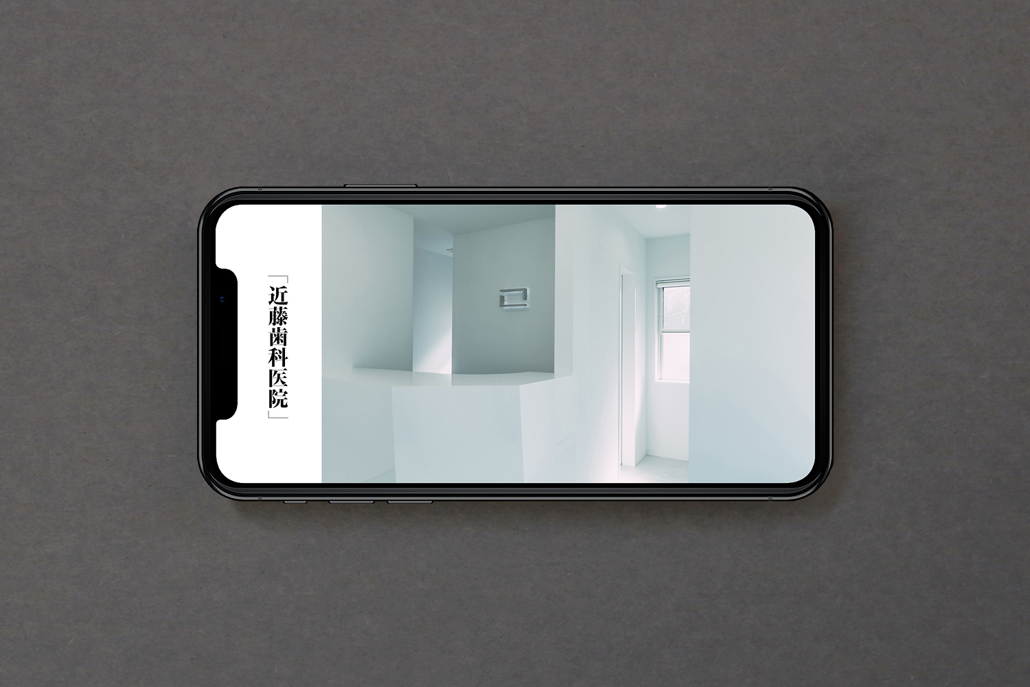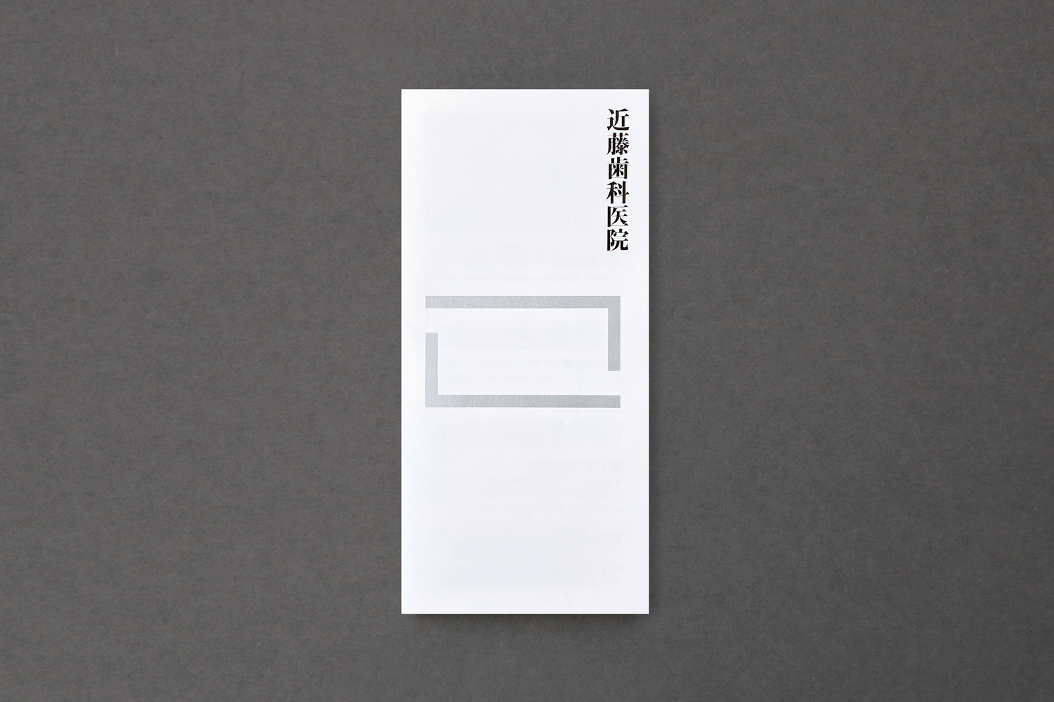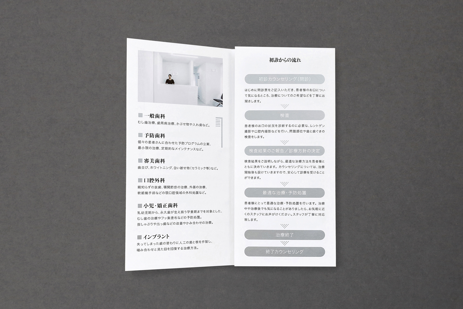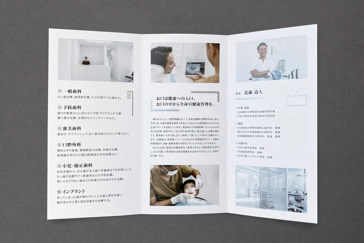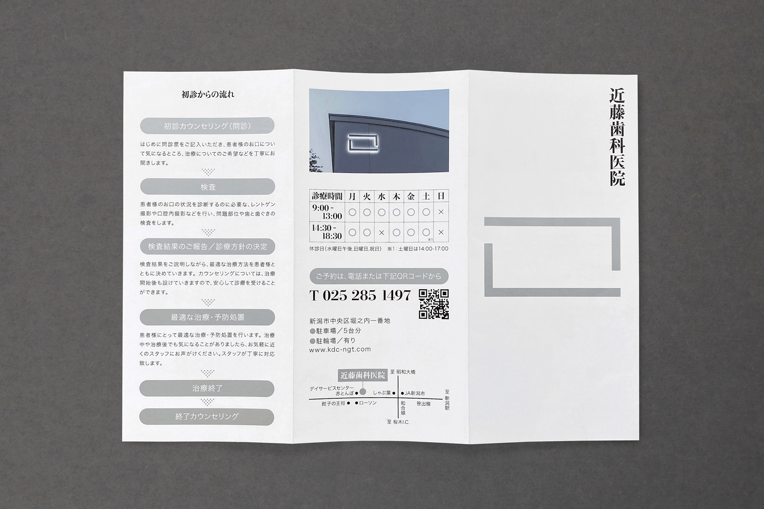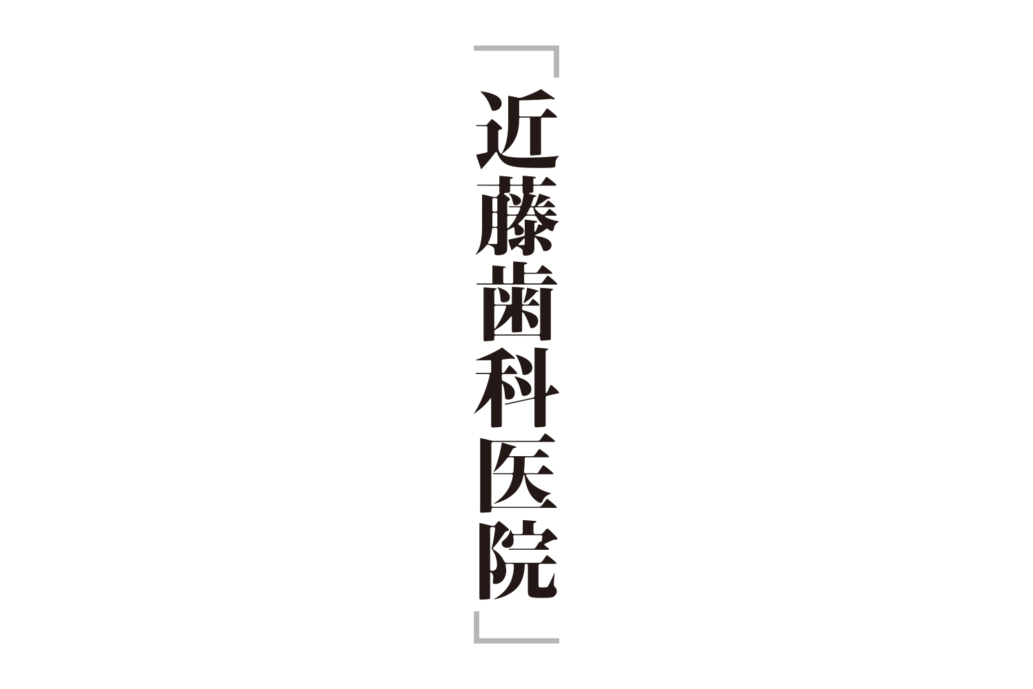
I was in charge of brand design for the clinic. Niigata City has many dental clinics in Japan. We started with consideration of the ideals, roles, and research of dental clinics. Next, at the interview with the director, I asked about the desire to support each individual's health while staying close to the patient. One answer that I came up with was “a posture that seriously faces the health of the oral cavity”. As a concept for design development, we have made a consistent development from graphic to spatial design, with the concept of “creating solid and solid teeth”. The main products are logos, interior design, graphic tools, sign plans, websites, flyers, and space design advice. The square brackets in the logo are “こ” and “mouth”, which means that the clinic wants to protect the oral cavity. The interior is pure white and clean and comfortable.
クリニックのブランドデザインを担当しました。新潟市は全国的にみても歯科医院が多く存在している街です。我々はまず歯科医院の在り方・役割・リサーチについての考察から取り掛かりました。次に院長へのヒアリングで「患者に寄り添いながら一人一人の健康のサポートをしたい。」という願いをお聞きしました。そこで辿りついた一つの答えは「口腔(身体)の健康に真摯に向き合う姿勢」でした。デザイン開発のためのコンセプトとして我々は「質実剛健な歯をつくる。」を掲げ、グラフィックから空間デザインまで一貫して開発をしました。主な制作物としてはロゴ、インテリアデザイン、グラフィックツール、サイン計画、webサイト、フライヤー、空間デザインアドバイスです。ロゴの鉤括弧は「こ」であり「口」であり、医院が口腔を守る存在でありたい事を体現しています。インテリアは真っ白で清潔感のある気持ち良い空間になっています。