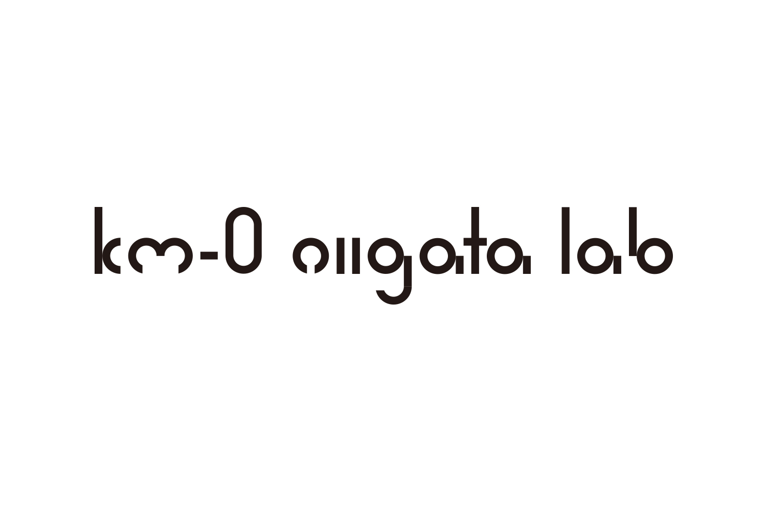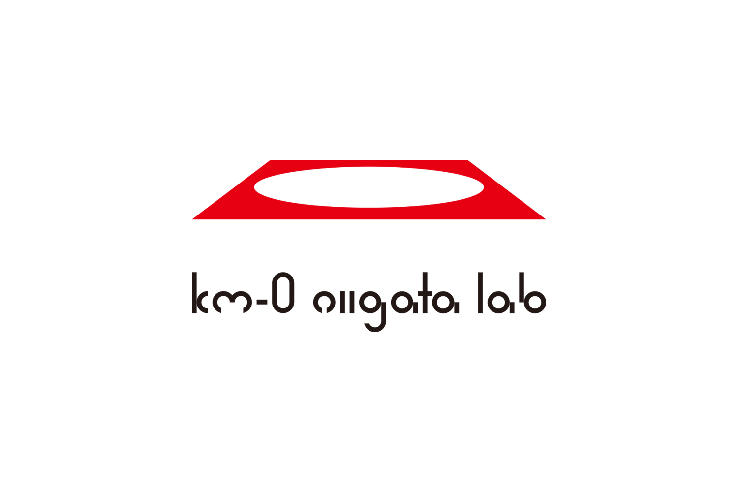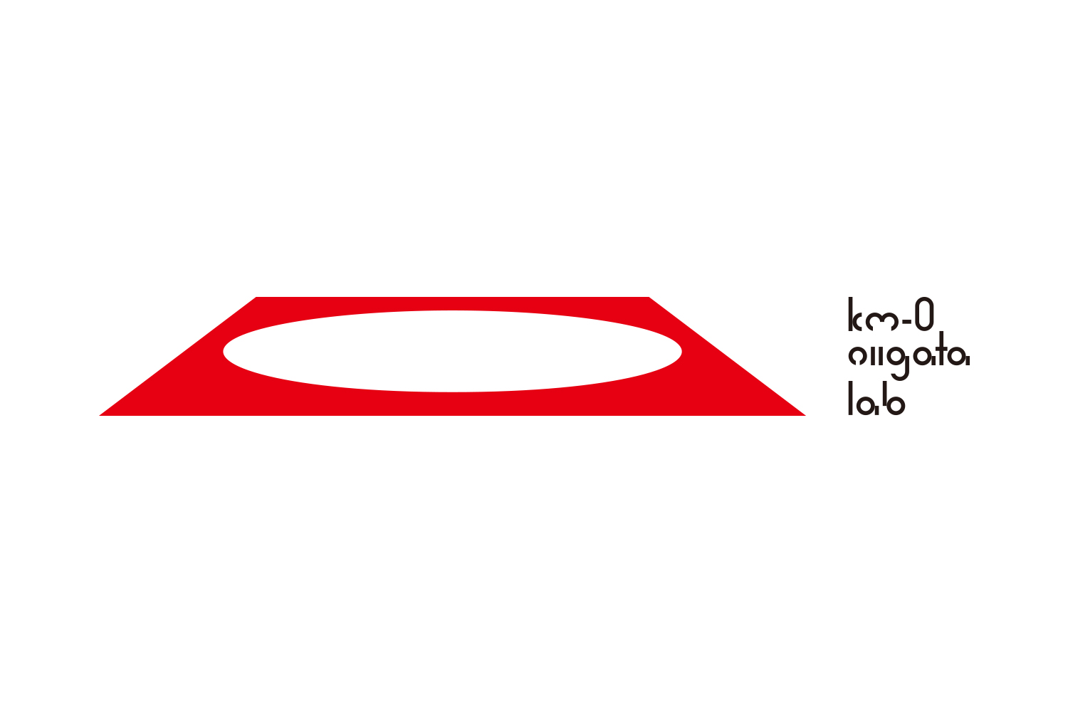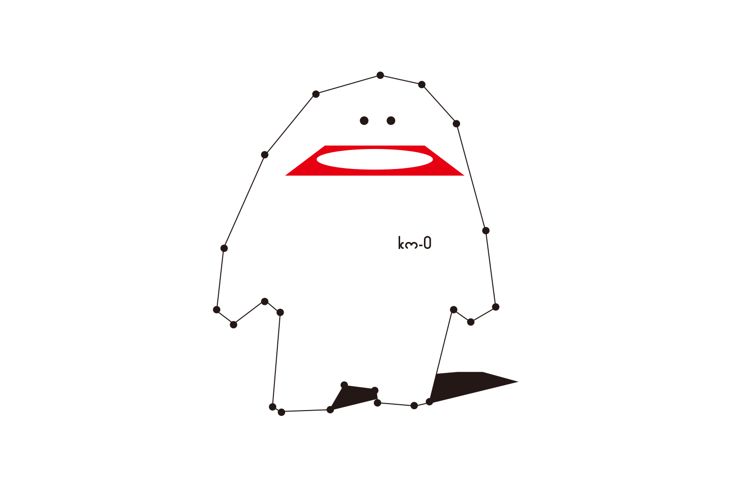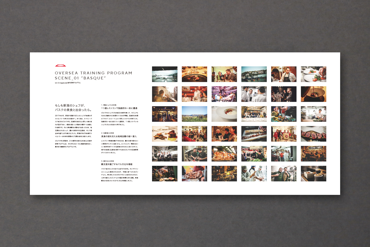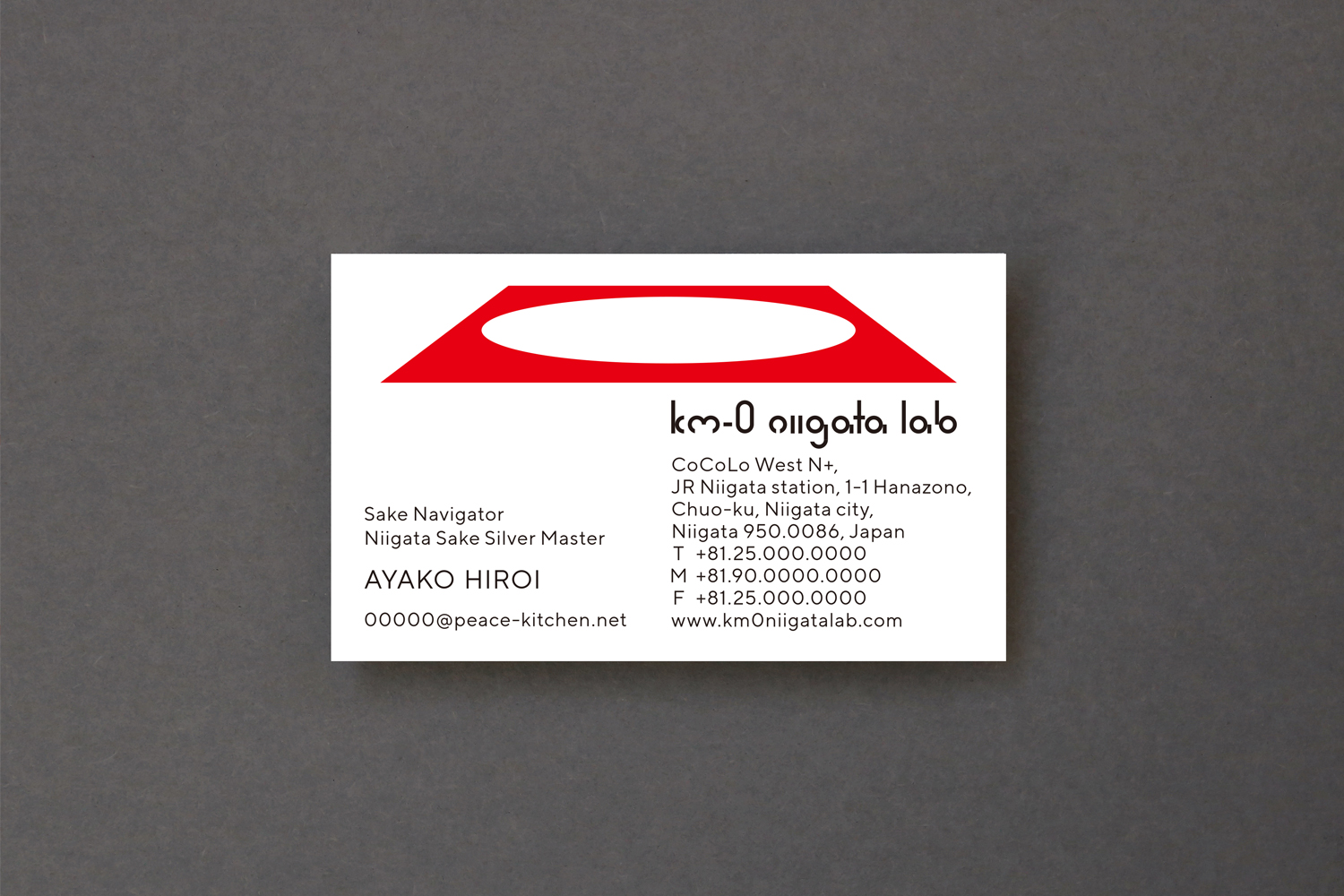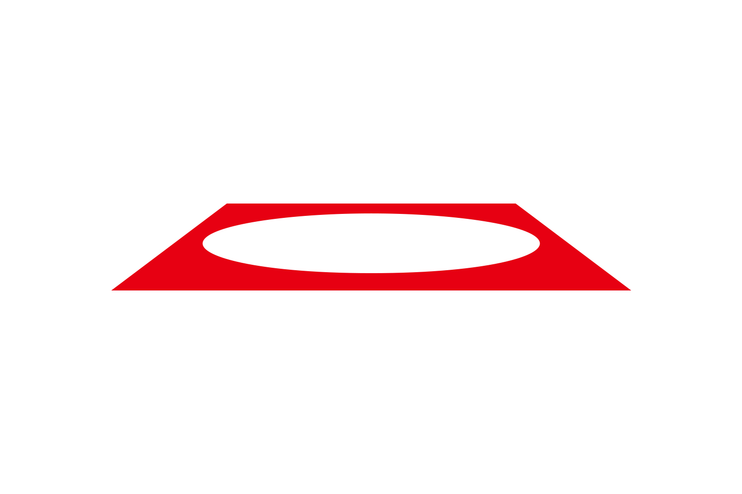
VI for a facility in Niigata Station (currently closed). In branding design, it is not uncommon to start with naming development, but in this case, the naming was decided in advance, and to be honest, I felt it was difficult to read and understand. It would have been easy to follow up with a design, but in this case, we decided to go against the grain and make the logo and typography themselves funny and interesting, rather than easy to understand. The logo is a white plate on a red table, and the name of the facility is 0. The character BIG MOUTH was created as a result of our own proposal to communicate the wide range of projects planned by the facility as clearly as possible. Niigata Station plays an important role as the beginning of a trip to Niigata, and I was able to take a closer look at how Niigata Station should be in Niigata City.
新潟駅内にある施設のVI。ブランディングデザインではネーミング開発から始めることも少なくないのですが、今回はネーミングが事前に決まっており、正直読み難さやわかり難さを感じました。デザインでそこをフォローすることは簡単ですが、今回はあえて逆手に取り、ロゴやタイポグラフィ自体もわかりやすさではなく、滑稽で気になるデザインにしてしまおうと考えました。ロゴは赤いテーブルに置かれた1枚の白い皿であり、施設名の0です。キャラクターのBIG MOUTHは施設が企画している幅広い事業展開をできるだけわかりやすく伝えていけるようにと自主提案し誕生したものです。新潟駅は新潟の旅の始まりとして人々に利用される重要な役割を担っているわけですが、あらためて新潟市における新潟駅のあり方というものについてじっくり考察することができました。