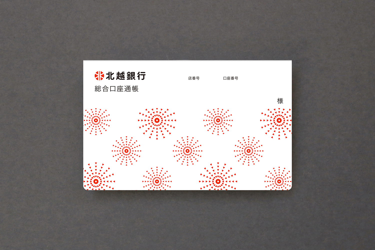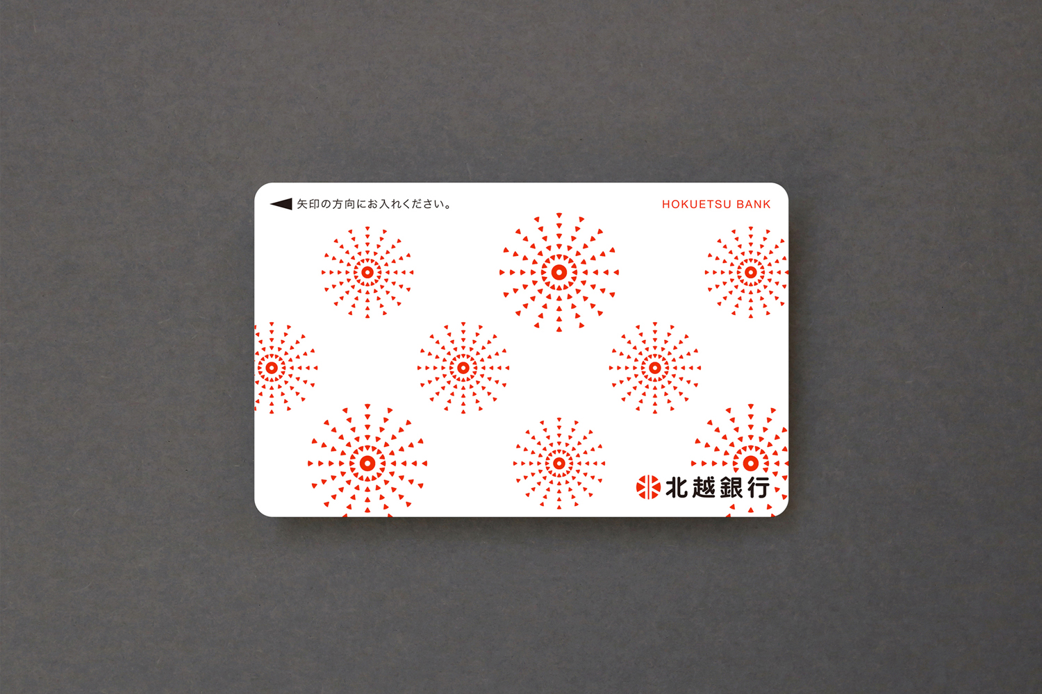
The Hokuetsu Bank has renewed passbooks and cash cards (total accounts) to commemorate the founding 140 years. Our company was in charge of art direction and design. Developing "Snow fireworks pattern" expressing Nagaoka fireworks by disassembling / rebuilding the Hokuetsu Bank's symbol mark with the concept of "New designs take over the thought to the area at the time of establishment and flower to the future" It was. It has become a refreshing and lively design that many people can become familiar with.
北越銀行は創業140年を記念し、通帳とキャッシュカード(総合口座)をリニューアル。弊社はアートディレクションとデザインを担当させていただきました。新デザインは「創業時の地域への想いを引き継ぎ、未来へ花開く」をコンセプトに、北越銀行のシンボルマークを分解・再構築することで長岡花火を表現した「雪花火文様」を開発し、あしらいました。多くの方に親しんでいただける爽やかで生き生きとしたデザインとなっています。