AWARDS : TOWARDS ASIA, NIIGATA ADC Grand Prize, Japan Package Design Association Election, Graphic Design in Japan Election, FOOD ACTION NIPPON AWARD
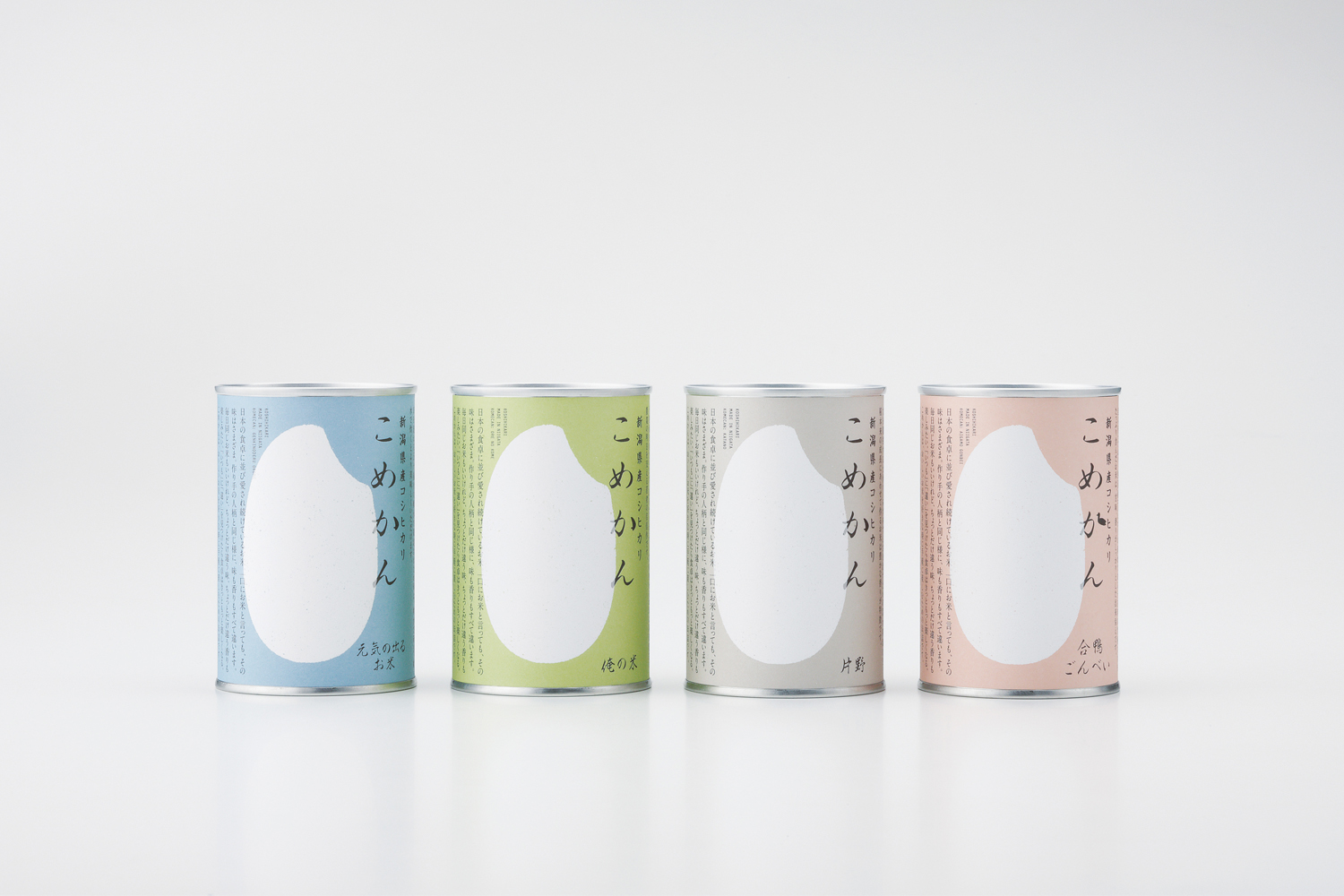
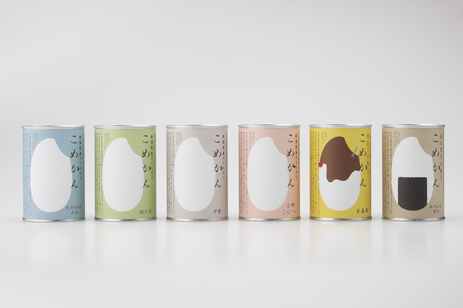
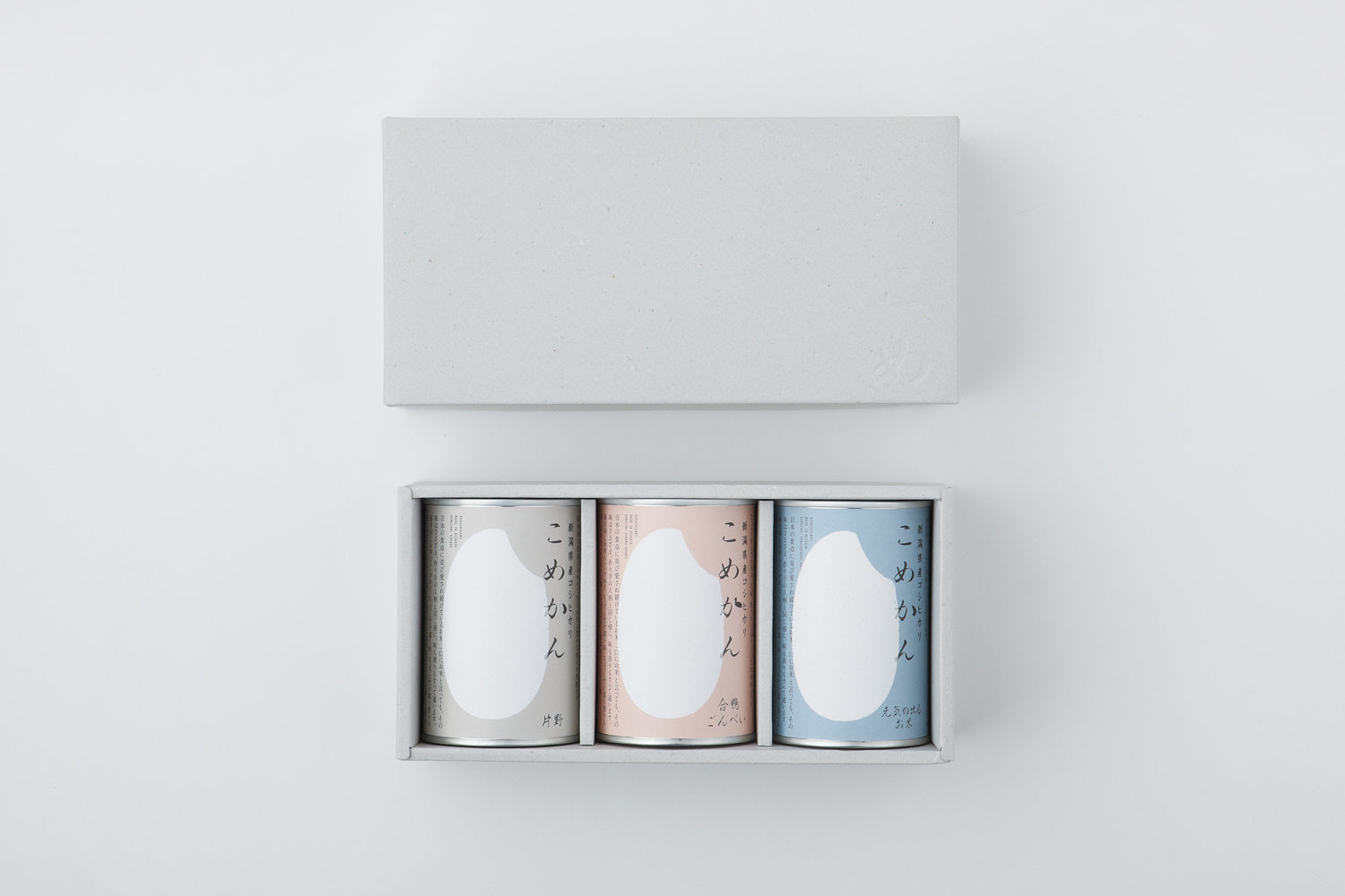
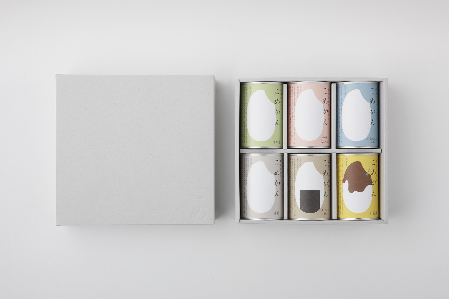
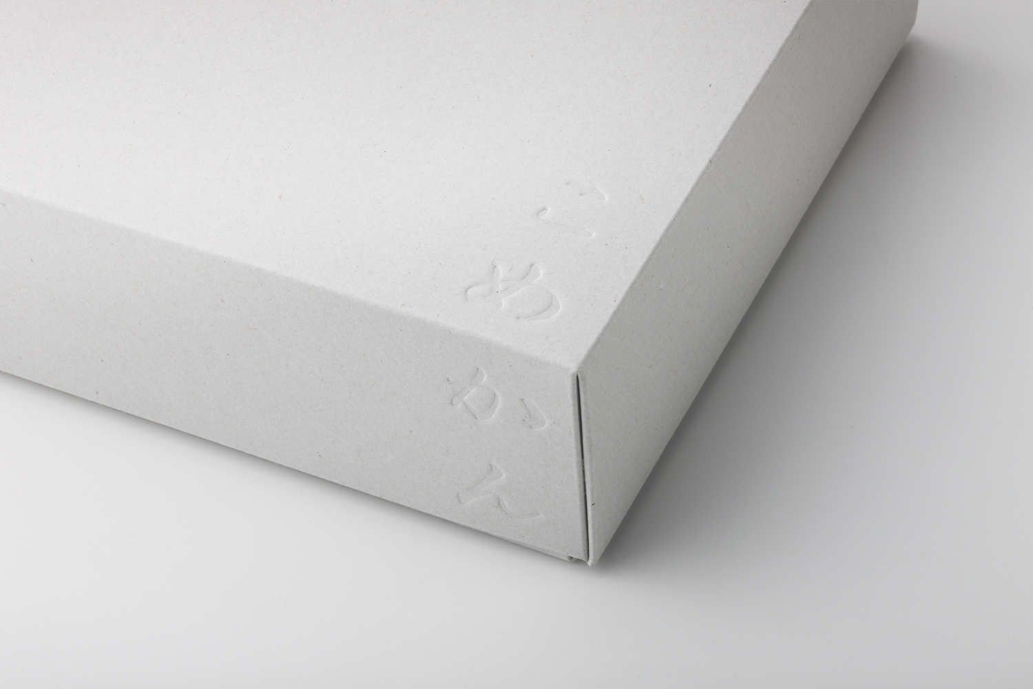
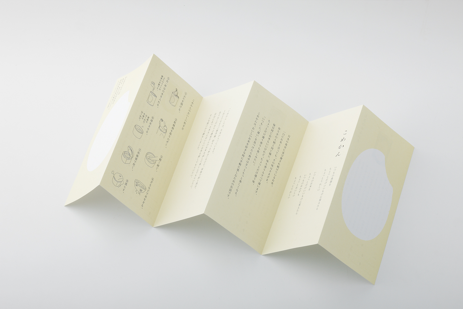
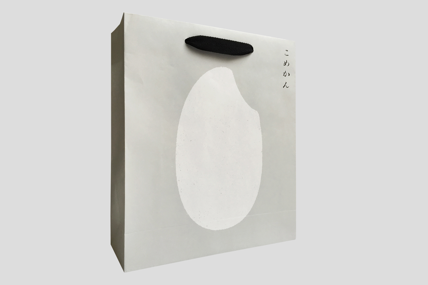
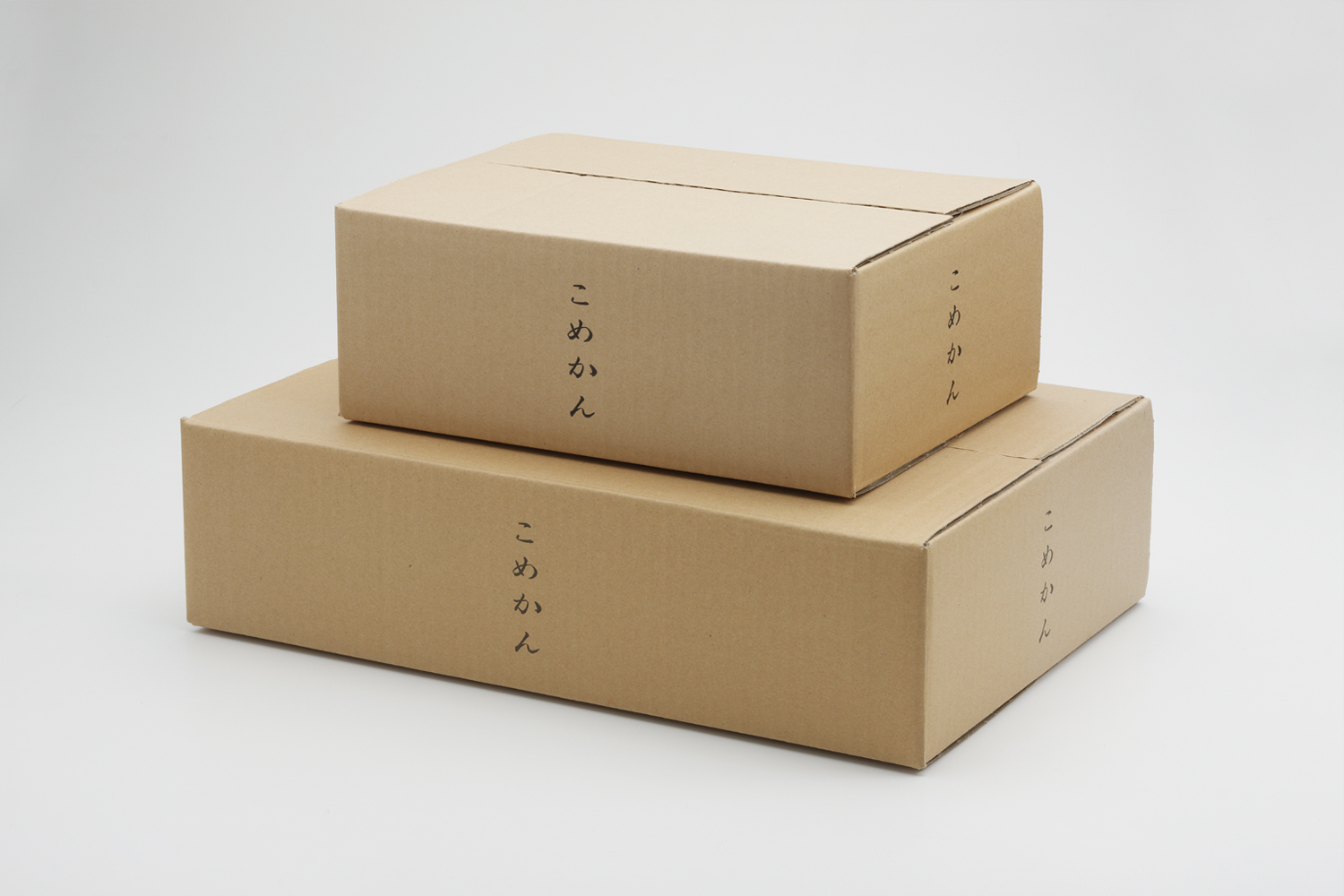
"The design concept was to be able to represent Japan. A grain of rice was used as the symbol inspired by the naming of the product, ‘Komecan’ which literally means canned rice, and therefore, a grain of rice on the can was an obvious choice. The product’s origin, producer, cooking method, as well as the graph, which indicates the taste of rice, are also printed on the label. A manual is included which tells the story of the product, as well as the portion of the use of water when water, that is, one cup of water per can."
受賞:トップアワードアジア受賞、新潟ADCグランプリ受賞、日本パッケージデザイン大賞入選、Graphic Design in Japan入選、フード・アクション・ニッポンアワード審査委員特別賞受賞
デザインコンセプトは、日本を表現すること。米の缶詰を意味する "こめかん"という商品名から、米粒をモチーフ。また、ラベルには商品の産地、生産者、調理方法、そしてお米の味を表すグラフが記載されています。商品のストーリーはもちろん、ご飯を炊く時に必要な水の量と1缶の水の量が同量、つまり1缶につき1カップの水を使うという部分を説明したマニュアルも付属しています。