AWARDS : YUSAKU KAMEKURA AWARD Nominated Works, Graphic Design in Japan "This One!" Election, NIIGATA ADC Second Prize Winner
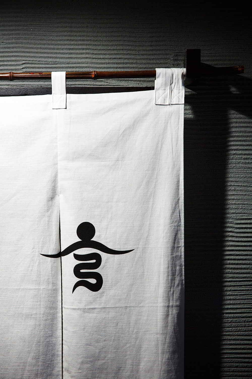
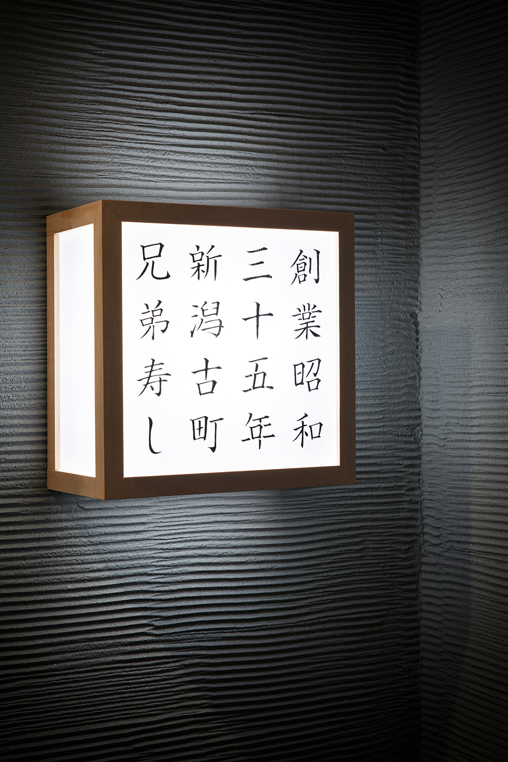
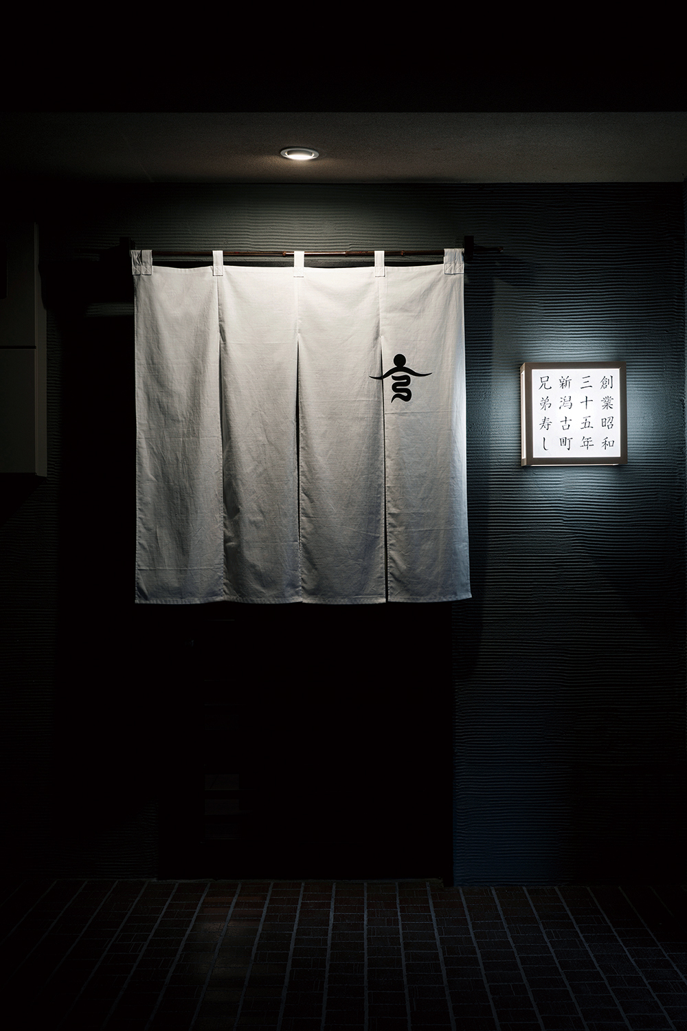
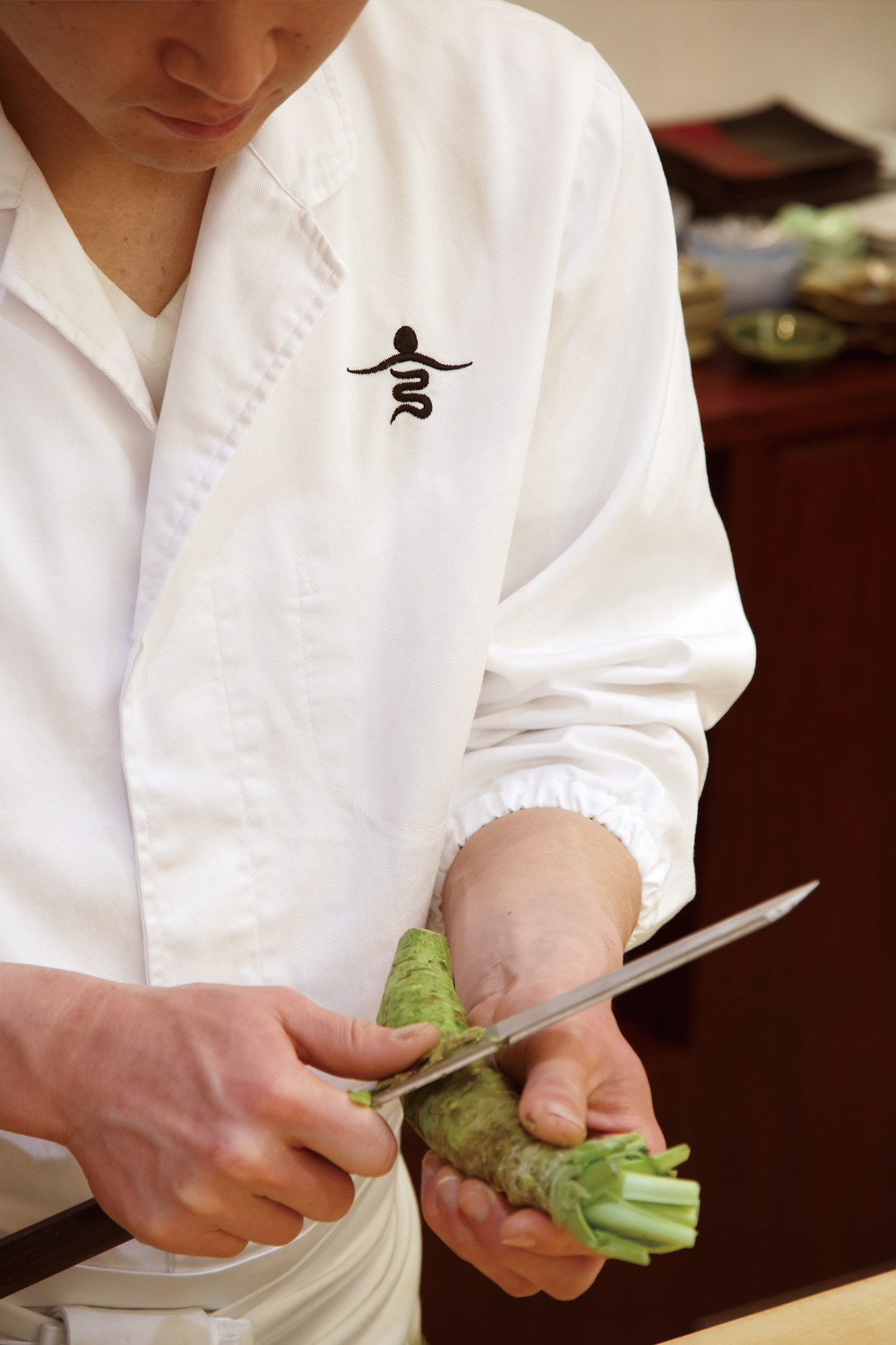
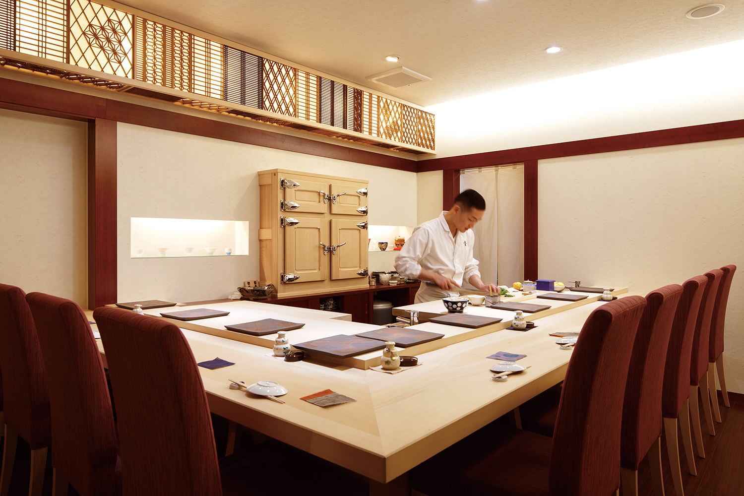
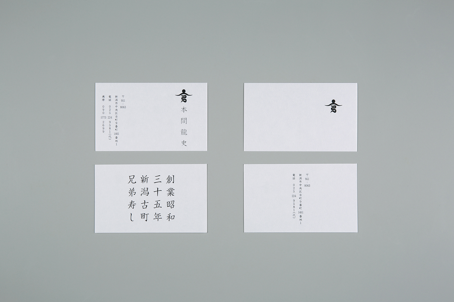
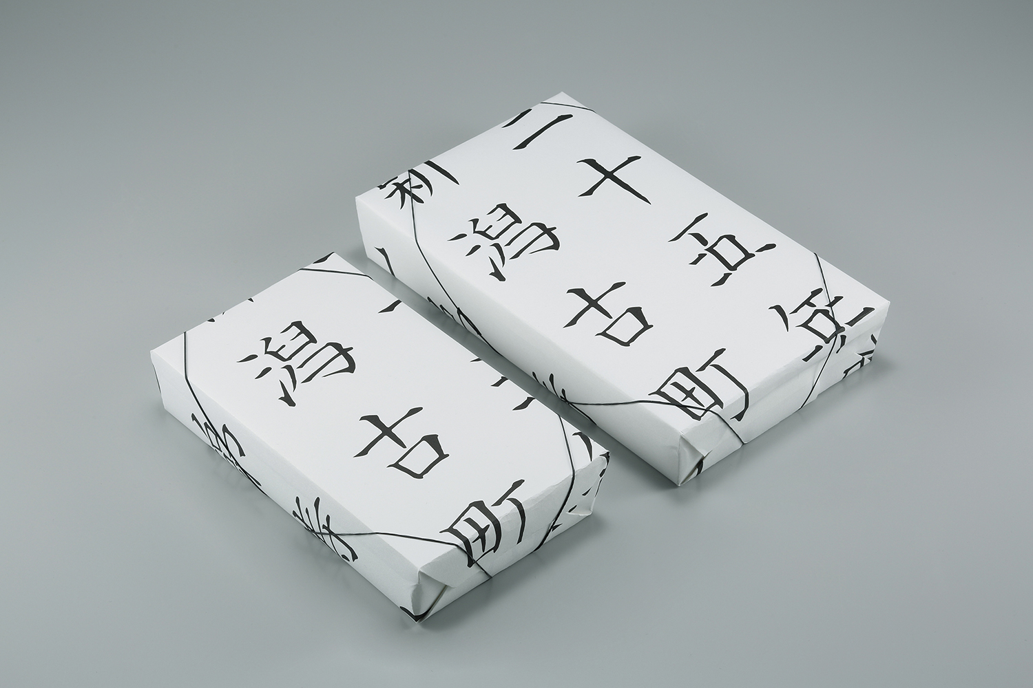
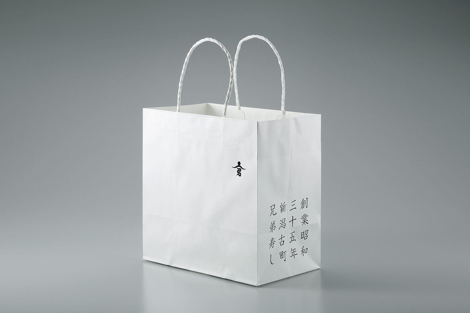
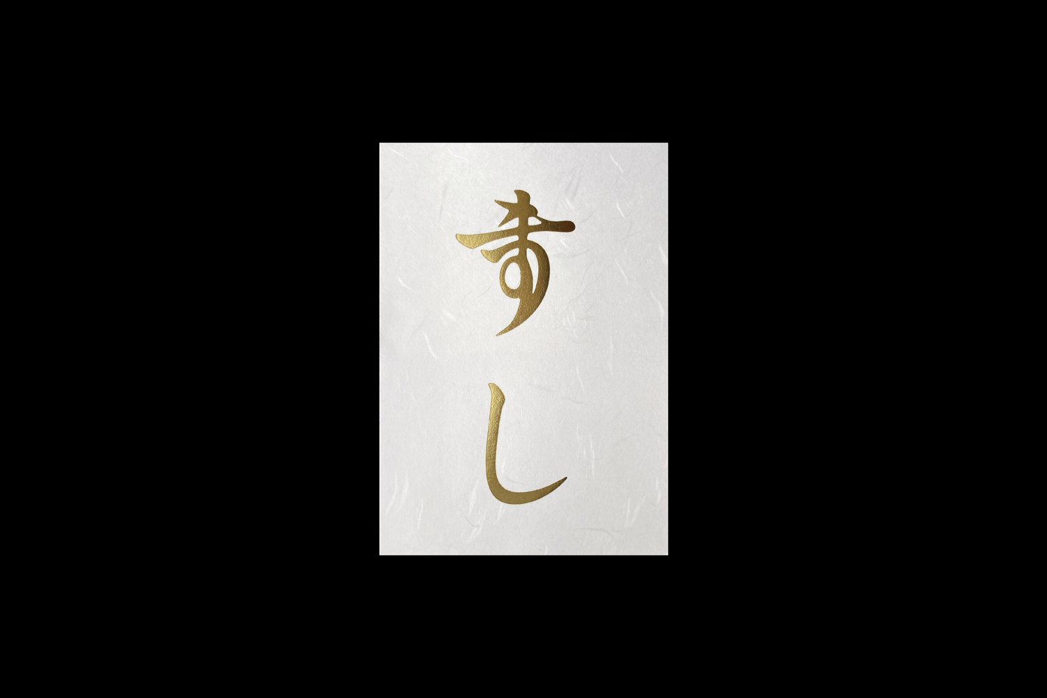
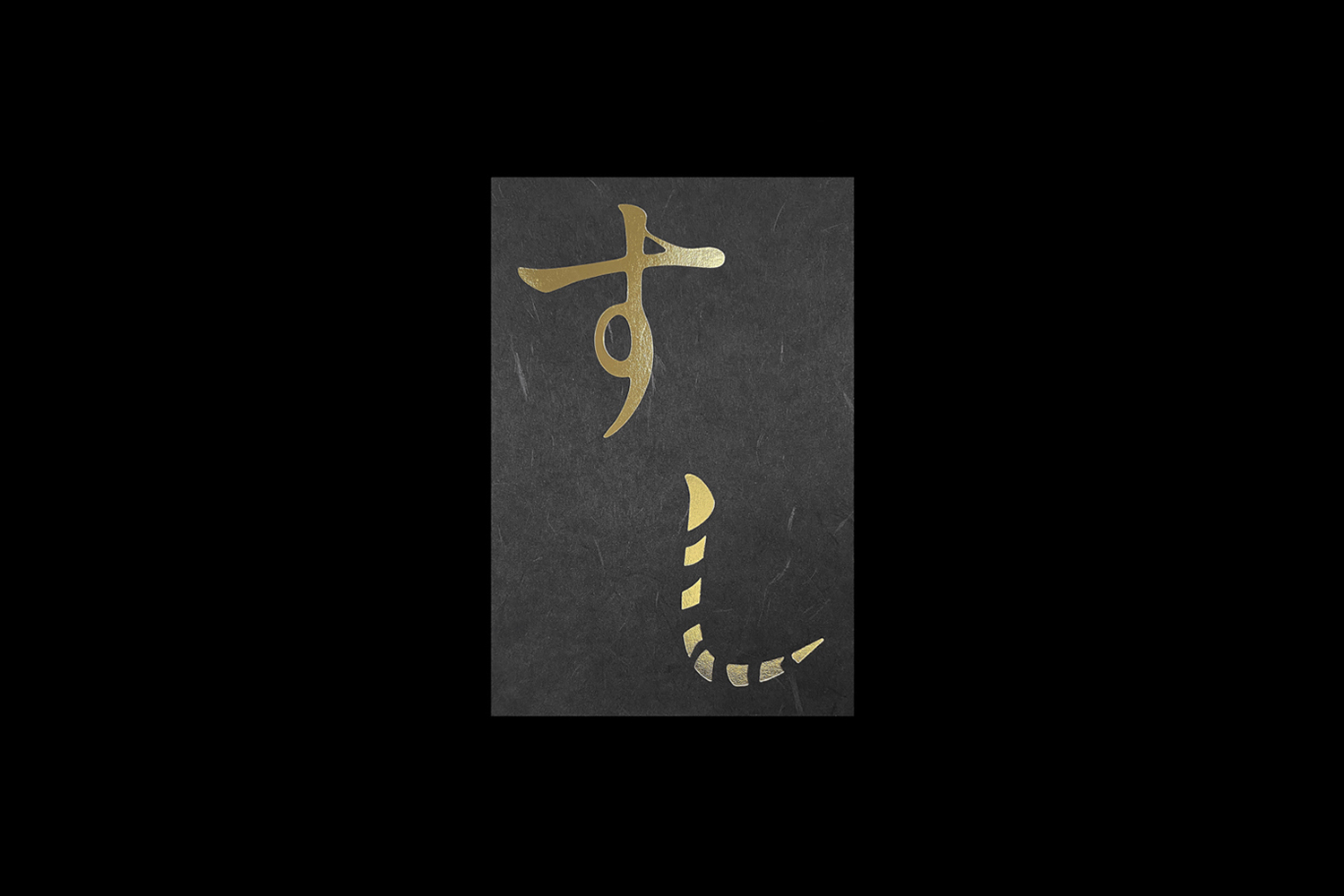
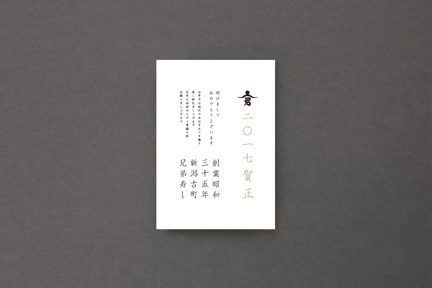
Furumachi 9th street in Niigata City, Niigata Prefecture, is one of the few places in Japan that still retains its old-fashioned atmosphere. Walking along the stone-paved street and entering a narrow alley, there is a sushi restaurant called KYOUDAI ZUSHI, which was established in 1960(Showa 35th). To celebrate the 55th anniversary of the establishment, the second owner carried out a complete renewal of the shop. DESIGN DESIGN was in charge of all the creative work and VI renewal. The owner and sushi chef, Mr. Ryuji Honma, is an honest and sincere man who says that being a sushi chef is a life training. We were impressed by his attitude, and developed the symbol mark based on the design concept of "The top is still a steep dragon's path". The symbol represents a rugged dragon's path leading to the top of the mountain where the sun rises. The top of the mountain and the sun represent the kanji character for "elder brother", while the steep dragon path represents the kanji character for "younger brother". We also wanted to unify the overall graphic design and create an atmosphere of both tension and comfort, which is the hallmark of the restaurant, so we used blank spaces in the VI. In developing the logotype, we wanted to convey the importance of the location and the history of the restaurant, which has been in business for two generations since 1960(Showa 35th), without using the official name “KYOUDAI ZUSHI". We also thought that the logotype needed delicate detailing, so we hid the kanji for "mouth" in each letter. We wanted to make sure that as many people as possible would try our food.
受賞歴 : 亀倉雄策賞ノミネート作品, Graphic Design in Japan "This One!"選出, NIIGATA ADC準グランプリ受賞
新潟県新潟市の古町九番町は昔ながらの情緒ある町並みを残す数少ない場所。石畳の道を歩き、狭い路地を入ったところに兄弟寿しという創業昭和三十五年の寿し屋があります。二代目店主は創業五十五周年を記念して店舗の全面リニューアルを実施。それに伴いクリエイティブワーク全般、VIの刷新をデザインデザインが担当しました。店主で寿し職人の本間龍史氏は、職人は人生修行だと語る実直真摯な方。その姿勢にデザインデザインは感銘を受け、シンボルマークは「頂は未だだ 険しい龍の道」をデザインコンセプトにデザイン開発。山の頂に陽が昇り、そこへと続く険しい龍の道を表現しています。山の頂と陽のでは「兄」の文字、険しい龍の道は「弟」の文字をモチーフにしています。そして全体グラフィックに統一して、店の特徴であるほどよい緊張感と居心地の良さを両方を兼ね備えた空気感をVIでも演出したいと思い、余白を活かしたデザインにしています。ロゴタイプの開発では正式な店名「兄弟寿し」をあえて使用せずに、昭和三十五年から二代に渡って続いている歴史と場所の重要性を感じてもらいたいと考え、「創業昭和三十五年新潟古町兄弟寿し」という名前を提案しました。また、ロゴタイプでは繊細なディティールづくりが必要と考え、一文字一文字に「口」という漢字を隠しました。ここには、「一人でも多くの方に食していただきたい」という願いが込められています。