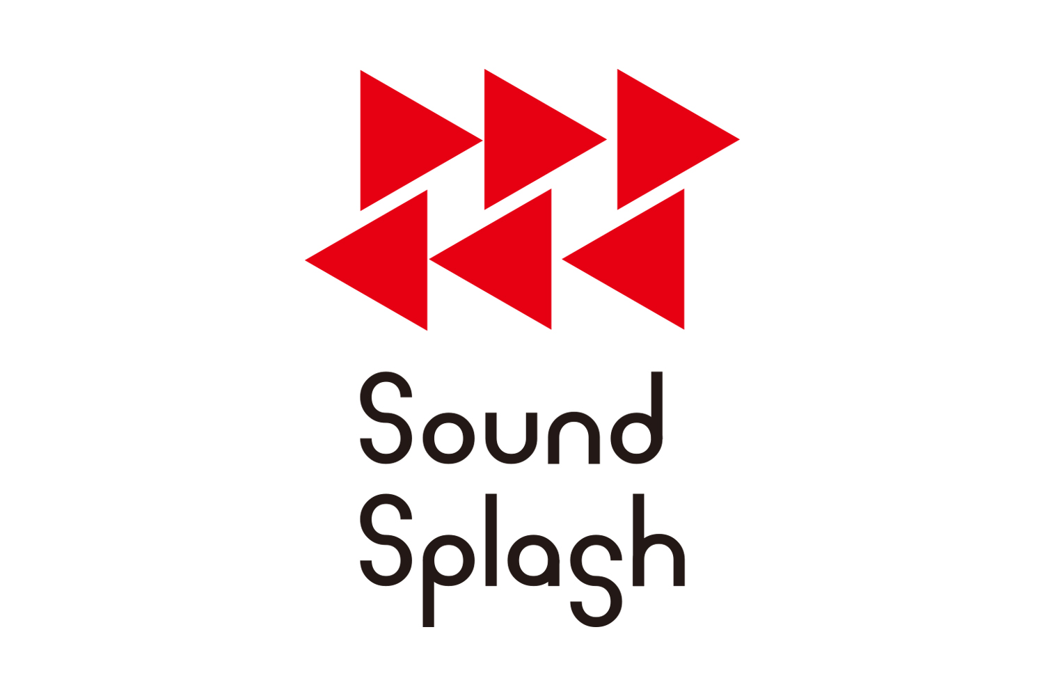
FM Niigata's flagship program “Sound Splush”. We redesigned the symbol mark and logotype to match the design of the program's original live towel. The red triangle represents the playback mark of a music player, and the rightward-facing triangle means “something new” in the form of a figure heading toward the future. The left-facing triangle means "something that will be loved for a long time. It represents a positive today that values the past and the future.
FM新潟の冠番組「Sound Splush」。番組オリジナルのライブタオルのデザインに合わせてシンボルマーク、ロゴタイプのリニューアルデザインを行いました。赤い三角はミュージックプレイヤーの再生マークを表し、右向きは未来へ向かう姿で「新しいもの」を意味しています。左向きの三角は「長く愛されるもの」を意味しています。過去と未来を大切にするポジティブな今日の姿を表現しています。