Dental Office VI Design
(Logo, Namecards, Facade and Entrance Sign)
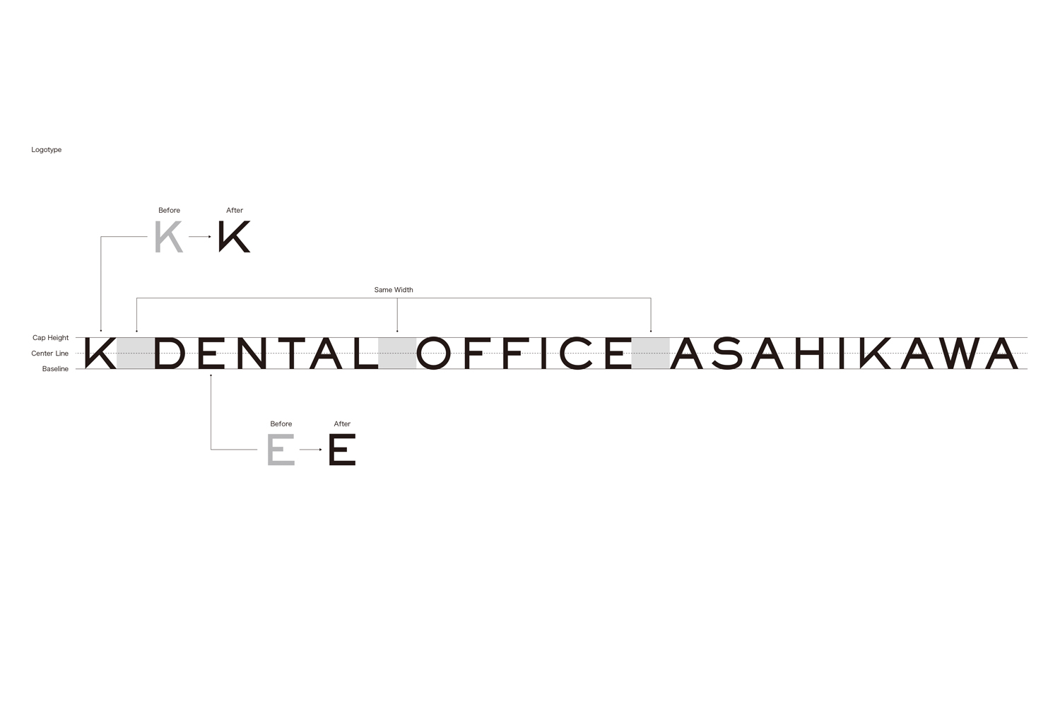
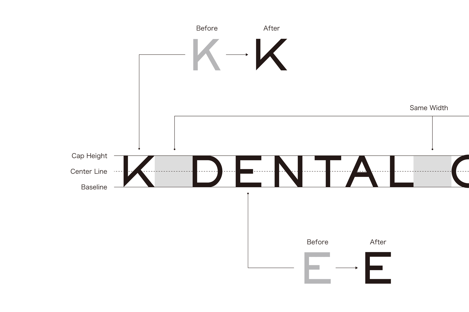
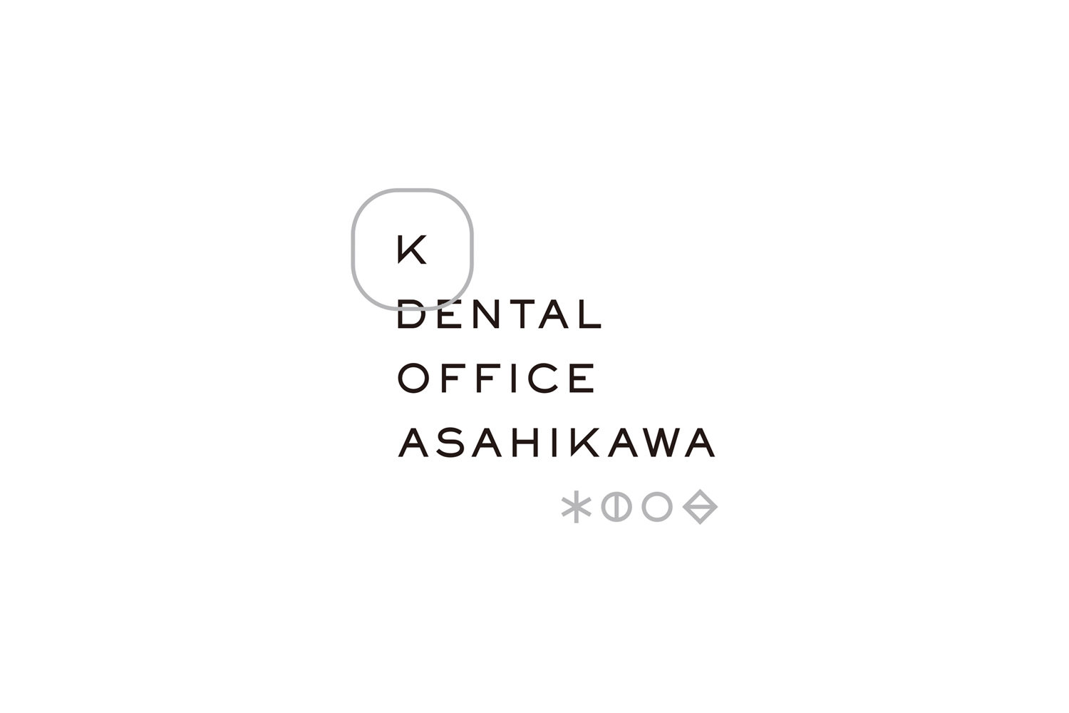
I was in charge of the visual identity (VI) design for "K DENTAL OFFICE ASAHIKAWA," a newly opened dental clinic located in front of Asahikawa Station in Hokkaido.
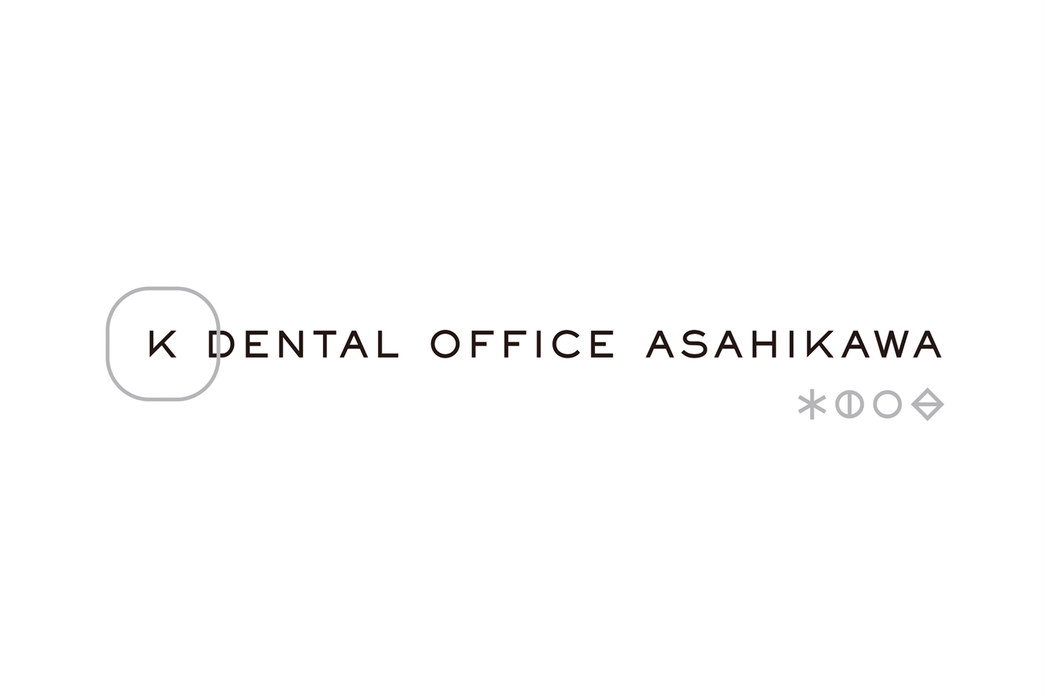
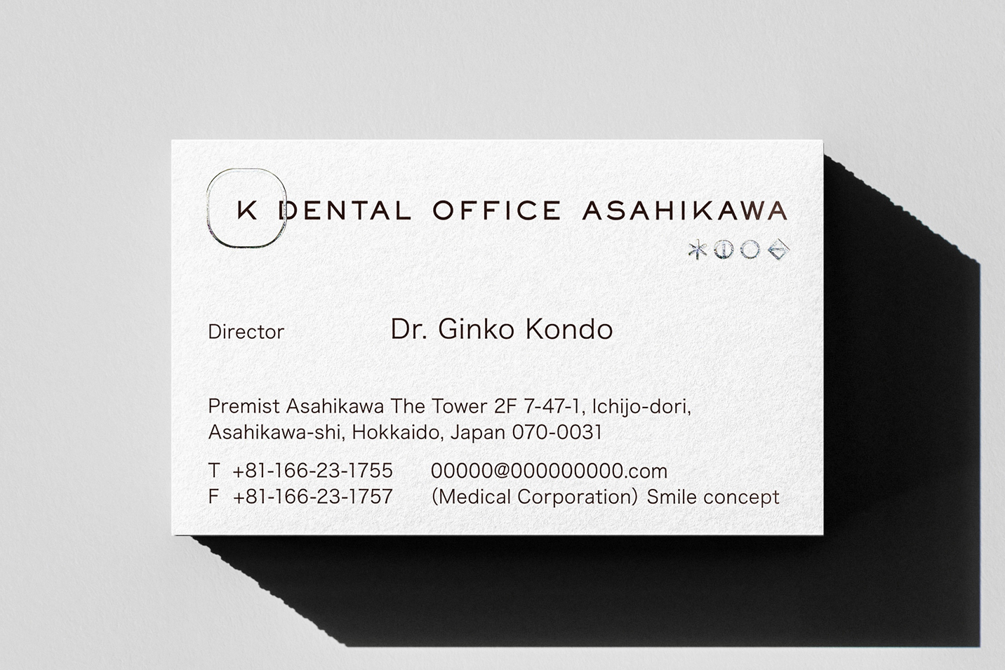
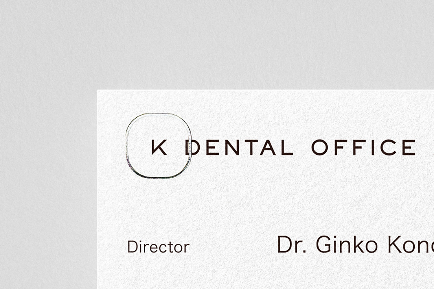
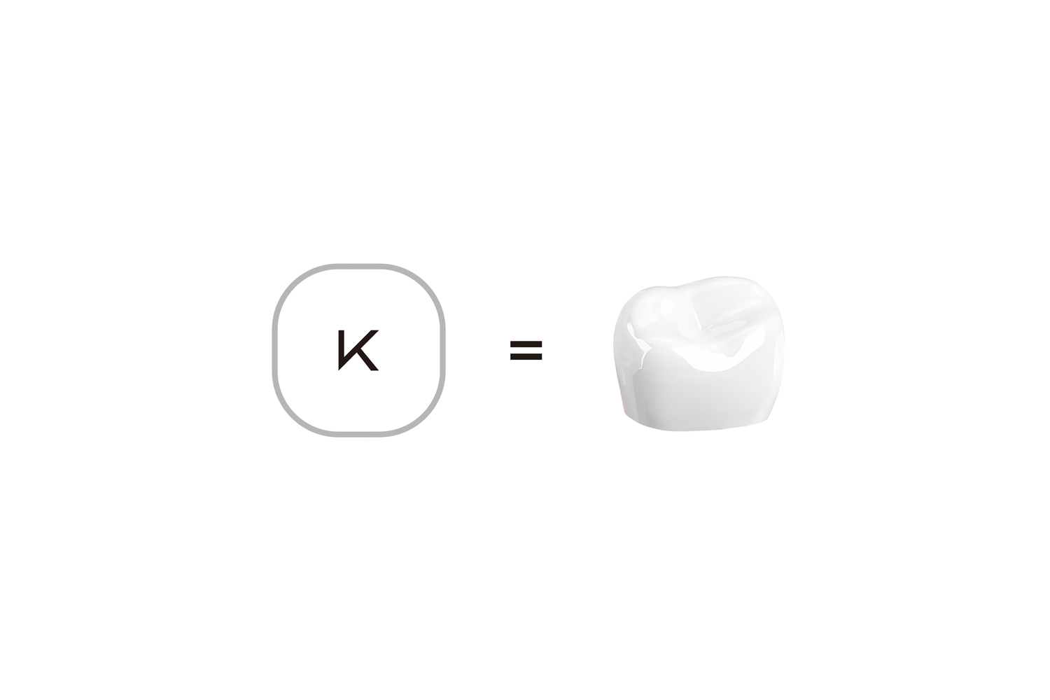
Symbol Mark
The design of the molar tooth symbolizes strength and trust. Inspired by this, we created a symbol mark where the initial letter "K" is enclosed in a circle, resembling a molar when viewed from above. Placing "K" at the center represents reliability, while the circular form conveys a sense of optimality and positive intent.
The use of fine lines gives the mark a refined and clean appearance, emphasizing a sense of elegance and hygiene — essential qualities in a healthcare setting. Overall, the symbol evokes harmony, professionalism, and dependability.
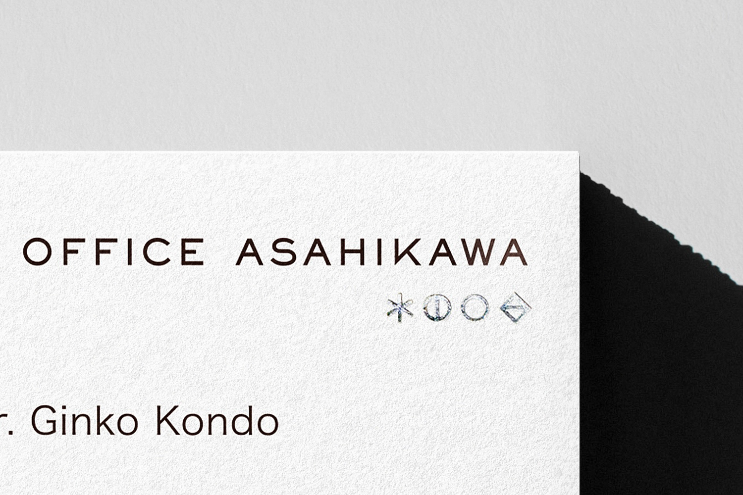
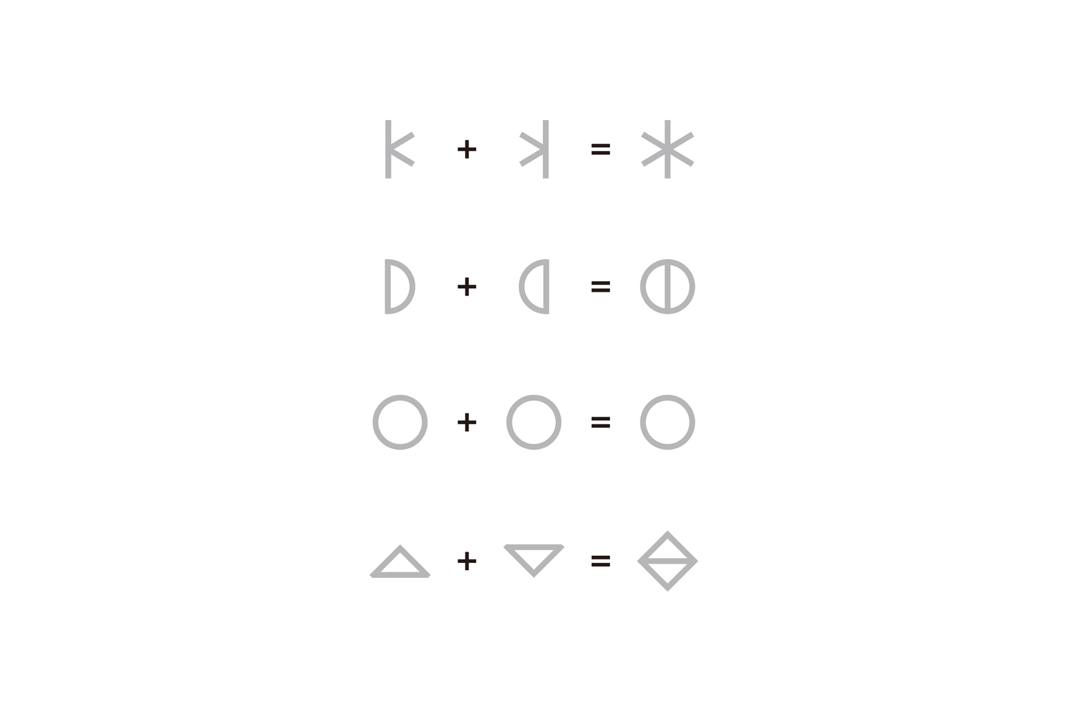
Communication Icon
To convey the importance of maintaining a clean and healthy oral environment, we developed a unique communication icon. It is composed of mirrored and joined versions of the initials K, D, and A, which represent the clinic’s name. This mirrored arrangement evokes the image of well-aligned, beautiful teeth.
At the center, the circle (〇) symbolizes an open mouth, expressing positivity and self-confidence. The icon as a whole visually communicates messages of beauty, health, and confidence in a simple yet meaningful way.
北海道の旭川駅前に道北初となるタワーマンション「プレミスト旭川ザ・タワー」が誕生。2階に開院した「K DENTAL OFFICE ASAHIKAWA」のVIデザインを担当しました。
大臼歯の造形は強固さと信頼の象徴です。このイメージをもとに、医院名の頭文字Kを丸で囲んだデザインを採用しました。この丸いフォルムは、上から見た大臼歯を想起させるとともに、Kが中心に配置されることで、頼られる存在としての信頼感を表現しています。また、丸で囲むデザインには最適解やポジティブな想いが込められており、全体として調和と安心感を与える印象に仕上げました。線は繊細な細線で描くことで、品格と清潔感を演出し、医療機関としての信頼性を高めています。
口腔の健康と美しさの大切さを伝えるために、コミュニケーションアイコンを開発しました。このアイコンは、医院名の頭文字であるK・D・Aをモチーフに、上下・左右に反転させて組み合わせることで、美しい歯並びを象徴的に表現しています。中央に配置された〇は、大きく開けた口をイメージしており、ポジティブな表情や自己肯定感の象徴として機能しています。このアイコン全体で、美しさ、健康、自信といったメッセージを、視覚的に明快に伝えることを目指しました。

*Facade Sign Photo: Ikuya Sasaki